claire.grillust.uk
  • Home
  • year 3 Semester 2
    • Finding my personal style
    • Comic book
  • Semester 1 yr3
    • History
    • Science
    • LIVE BRIEF student charter
  • Course Work- Links
    • West Walls - Live Brief
    • Second year >
      • project 1 >
        • week 1 - inks
        • week 2 - 3D
        • Week 3 - Paints
      • Project 2 >
        • Photoshop band posters
        • Illustrator pins
      • Project 3 >
        • Action
        • Body Language
        • Communicative Colour
      • Illustration in response to written word >
        • 1 conceptual editorial
        • Literal Illustration
        • The one where they pick
    • First Year >
      • SET EXERCISE
      • SEMESTER 2 >
        • 2D
        • 3D
        • 4D
      • SEMESTER 1 >
        • project 1
        • Project 2 >
          • project 2 (part 1)
          • project 2 (part2)
          • project 2 (part3)
        • project 3 >
          • Project 3- Part 1
          • project 3 part 2
          • Project 3. Theatre poster
        • project 4 >
          • Project 4 Colour
          • Typography
          • Book Covers
          • Song Book

Development

Sketchbook work and inspo 

Picture
Picture
Picture
Woodpecker
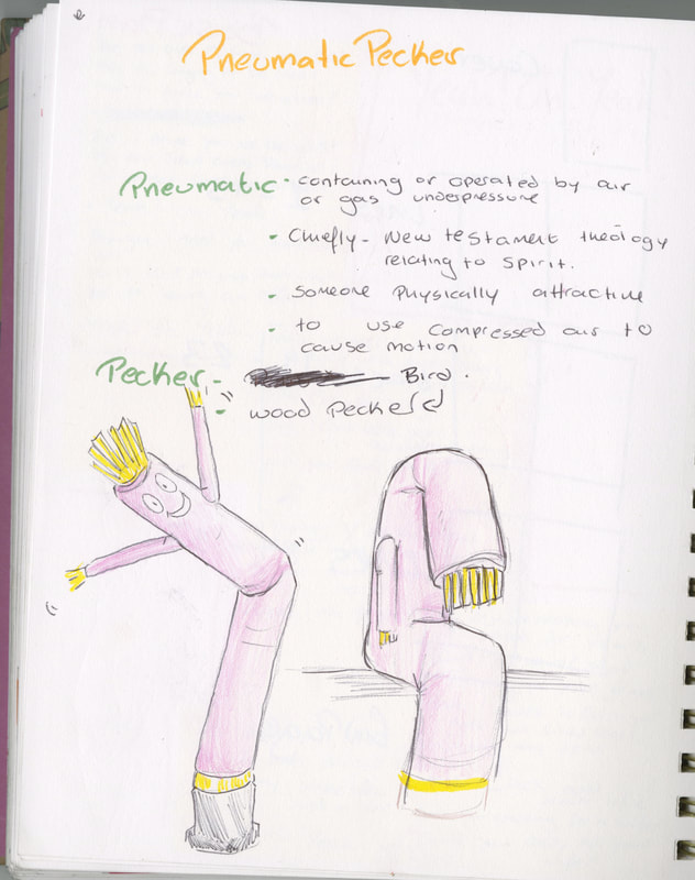
I began the project by identifying the key aspects of the phrase 'pneumatic pecker'. I began by messing with the joke idea of an inflatable tube man as this worked with the pneumatic element. Additionally, I noted down what a pneumatic circuit looked like, just in case I could use it in the future. 
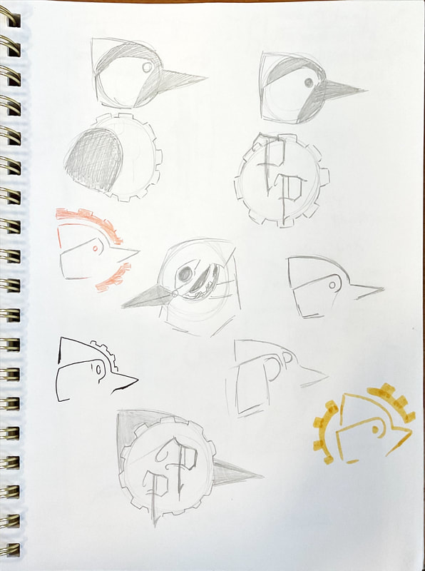
I took the word pecker and went the bird route. this lea me into looking into woodpeckers and how I could incorporate them into my work. 
Picture
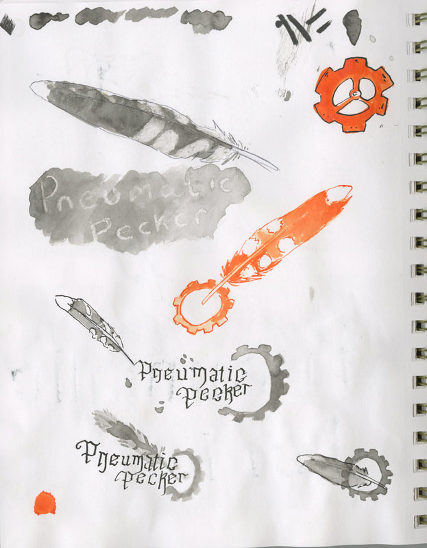
The feathers of a woodpecker

Picture
Picture
Picture
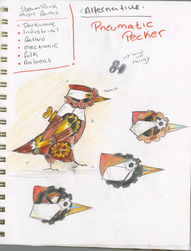
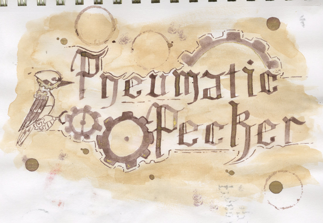
I decided to turn the idea of the pneumatic machinery into steampunk. This lead me to develop the idea of a mechanical woodpecker helping the logo fulfil the idea of a 'pneumatic pecker'.

Picture
I would like the colours to fit in with the steampunk aesthetic. this means using coppers and golds. I would also like to bringing the black, whites and reds of the bird  to make it look more recognisable. 

One problem that I was facing was the genre that the band was going to be . originally, I went with heavy metal to work with the machinery aspect this then lead me to the steampunk aesthetic. after developing my ideas more i found that Heavy metal was too harsh.
Picture

Typography 

Picture
Picture
Picture
Picture
Picture
Picture
With the steampunk theme being established, I wanted to make sure that any typographic elements would follow the theme. 
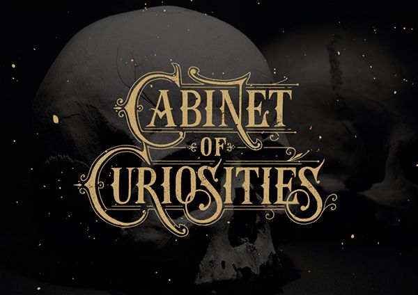
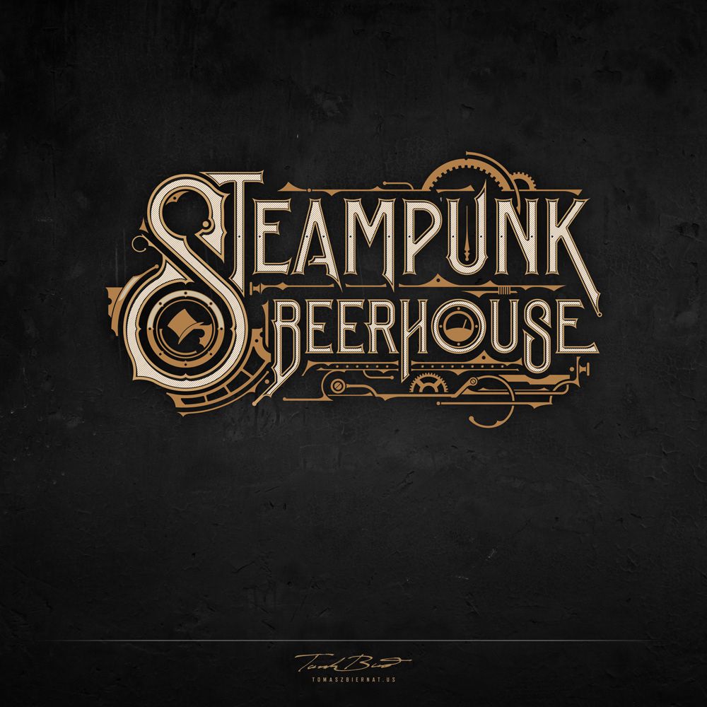
I started off by looking on Pinterest for steampunk type. when doing this, I found that I enjoyed the more swirly type with the extra lines and images around to heighten the steampunk aspects. 
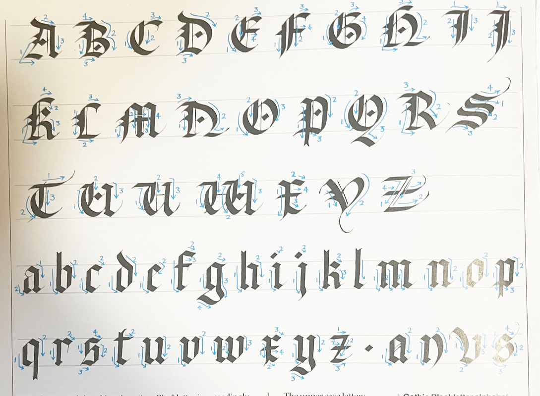
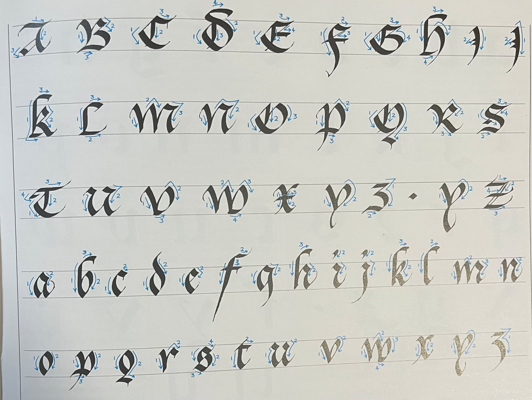
This lead me to look in a calligraphy book for gothic fonts that could be used. I also looked on Dafont and managed to find a couple of fonts that I would like to replicate. 

Picture
Picture
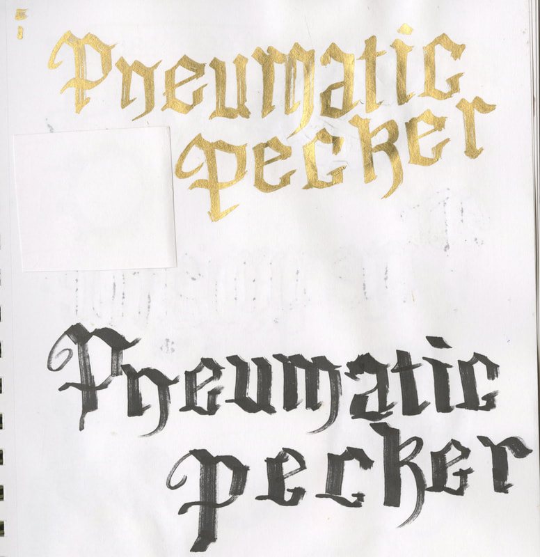
Gold chisel tipped marker and Black chisel tip alcohol marker
Picture
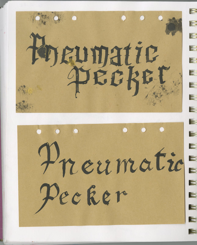
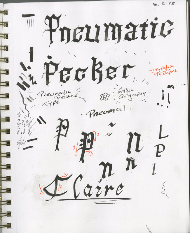
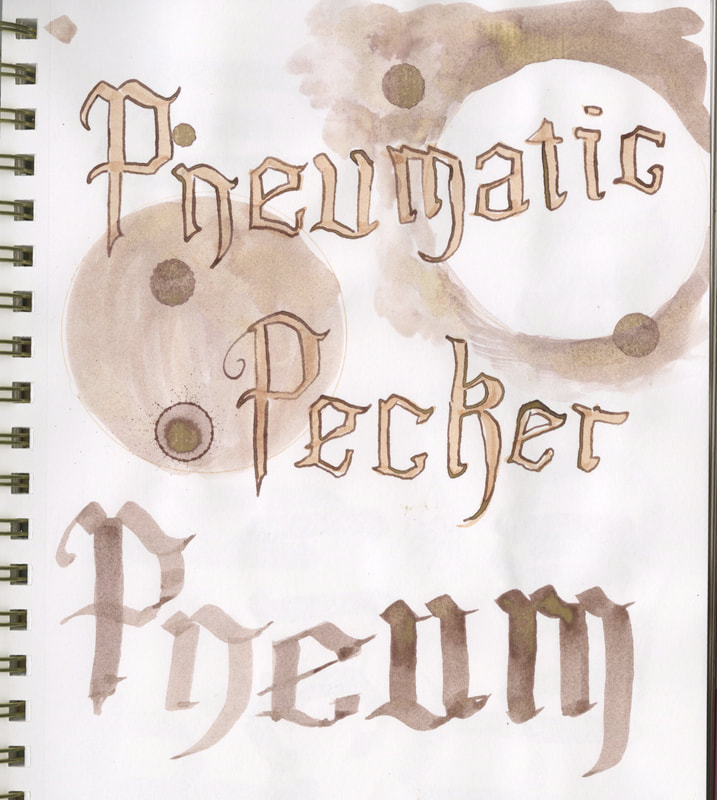
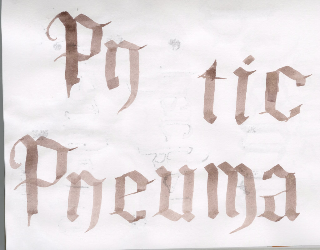
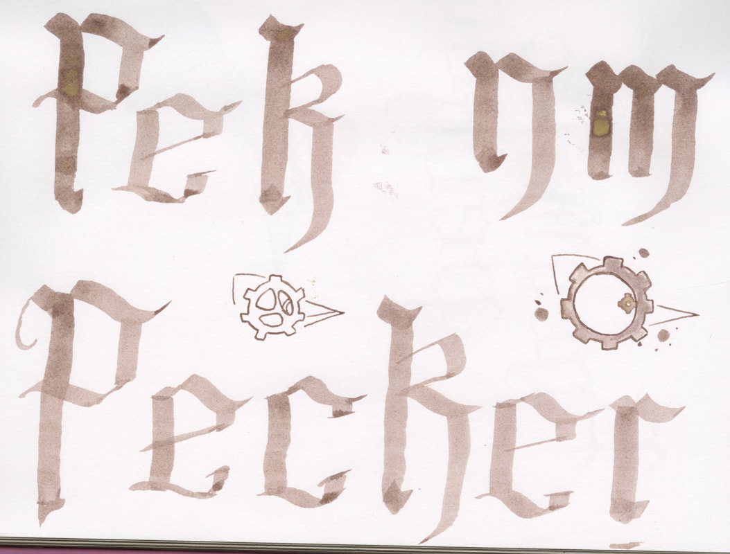
I started out by using my dip pens with a flat nib to try and replicate the calligraphy styles that i had previously looked at. This was challenging as this was my first real look into calligraphy, because of this I began to experiment more in how I can use different mediums to replicate the stye of a dip pen. 
I found that any pen with a chiseled nip can be used to replicate this specific style, this gave me a larger range of materials to work with. 
Picture
Top - Brown alcohol marker _ Bottom- Flat pain brush and ink
Picture
Water based felt tip - wax crayons - black and brown ink
Picture
Picture
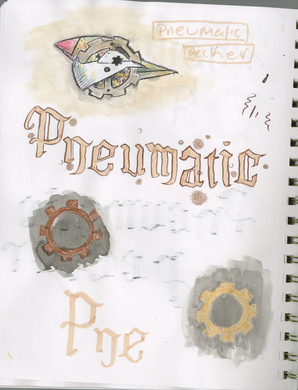
Here I wanted to replicate some of the steampunk typography I had seen. I decided to start of simply with just a darker outline on the type, I also added in some extra lines to bring in more of a gothic style. 
I also began to add in some wax crayons to see how the wax resist technique would work within the style. i find that against the black ink, the lighter colours are much easier to see. 
Picture
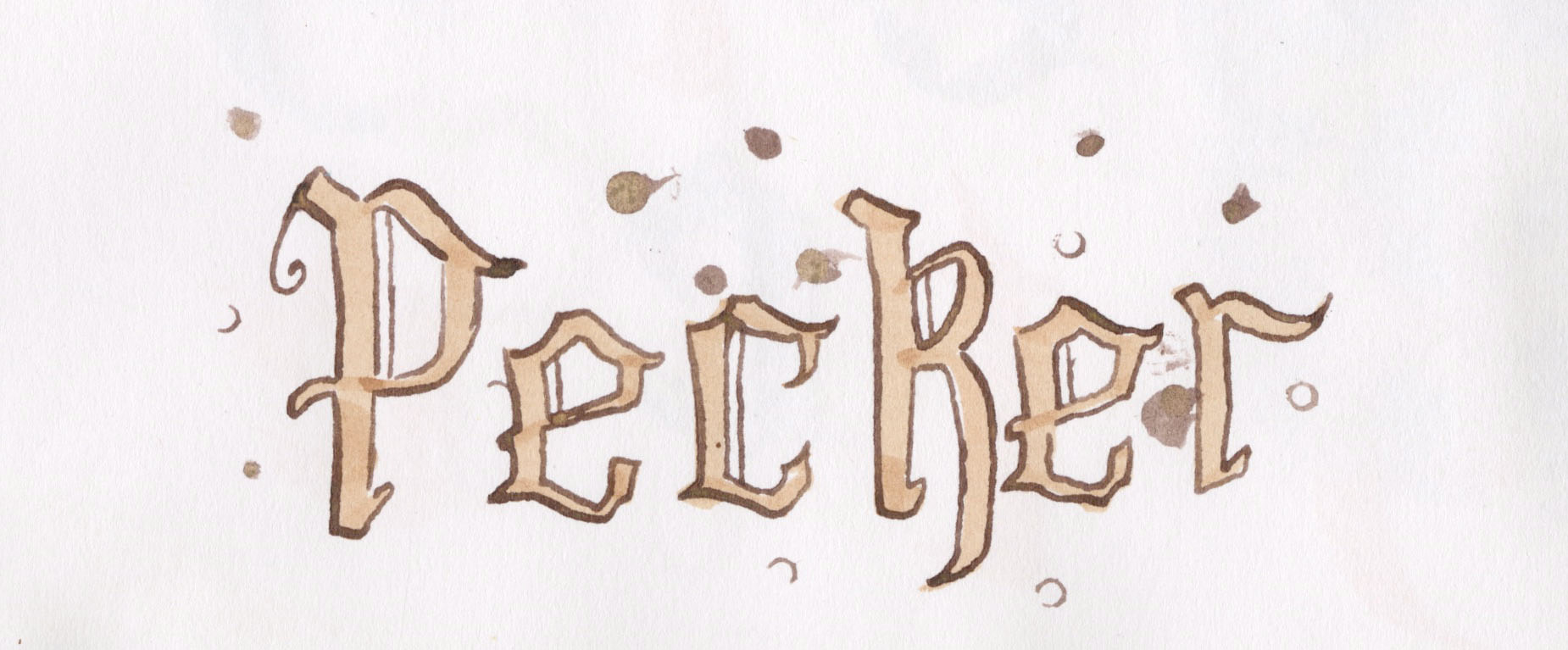
Flat brush and brown ink
Picture
Picture
Picture
Picture

Picture
Picture
wax resist and ink
Picture
Picture
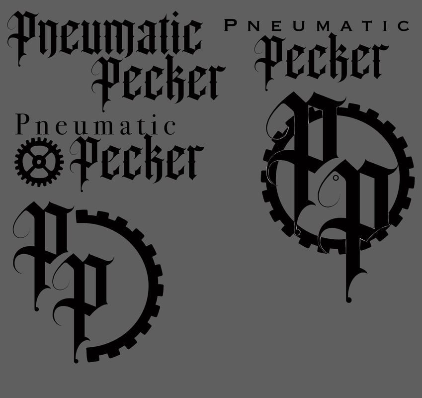
I began to look into ways that I could simplify my ideas in a way that would still work alongside the band name. I also looked into some digital type, I took some of the ideas that I had previously developed and took them into Illustrator.
Site powered by Weebly. Managed by 34SP.com
  • Home
  • year 3 Semester 2
    • Finding my personal style
    • Comic book
  • Semester 1 yr3
    • History
    • Science
    • LIVE BRIEF student charter
  • Course Work- Links
    • West Walls - Live Brief
    • Second year >
      • project 1 >
        • week 1 - inks
        • week 2 - 3D
        • Week 3 - Paints
      • Project 2 >
        • Photoshop band posters
        • Illustrator pins
      • Project 3 >
        • Action
        • Body Language
        • Communicative Colour
      • Illustration in response to written word >
        • 1 conceptual editorial
        • Literal Illustration
        • The one where they pick
    • First Year >
      • SET EXERCISE
      • SEMESTER 2 >
        • 2D
        • 3D
        • 4D
      • SEMESTER 1 >
        • project 1
        • Project 2 >
          • project 2 (part 1)
          • project 2 (part2)
          • project 2 (part3)
        • project 3 >
          • Project 3- Part 1
          • project 3 part 2
          • Project 3. Theatre poster
        • project 4 >
          • Project 4 Colour
          • Typography
          • Book Covers
          • Song Book