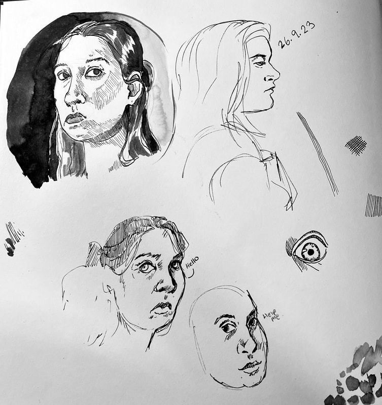
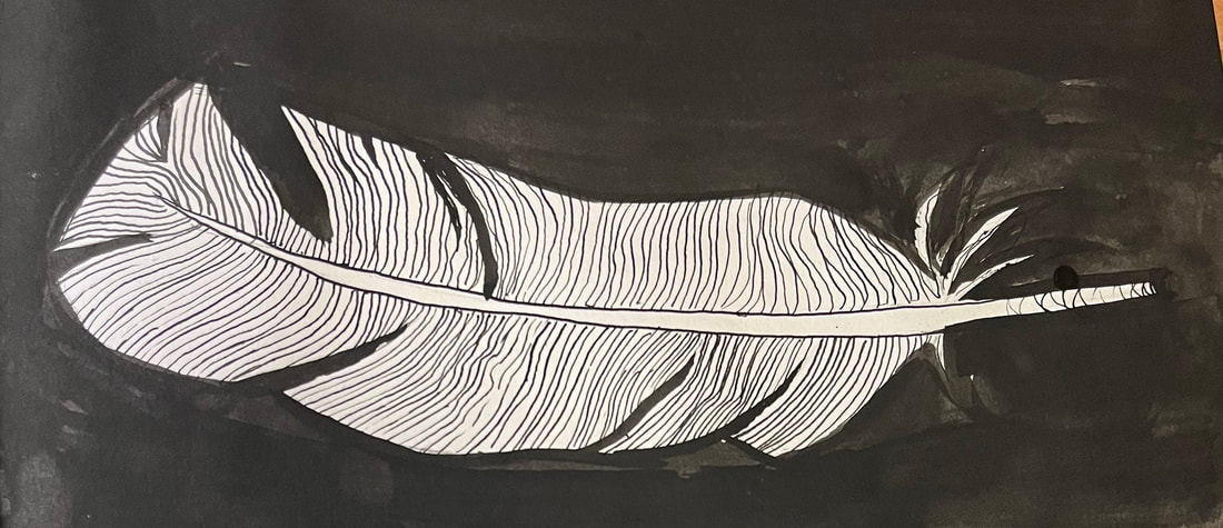
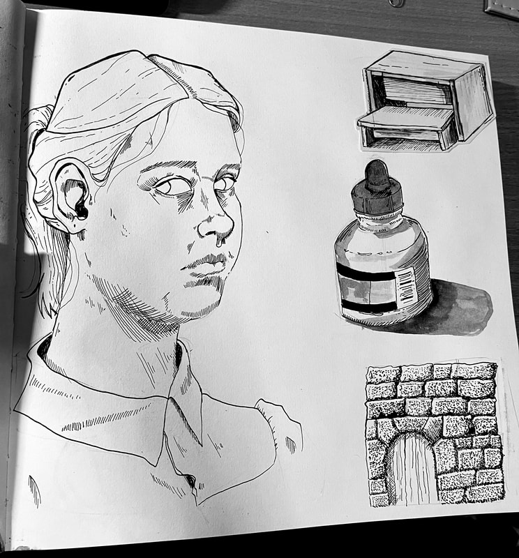
For this first week, I worked on developing my understanding of inks and how to use them to achieve different results.
|
I had to work on still life's and portraits, I placed a mirror on my desk and looked over at it to help me catch my likeness. I also worked on drawing the people around me.
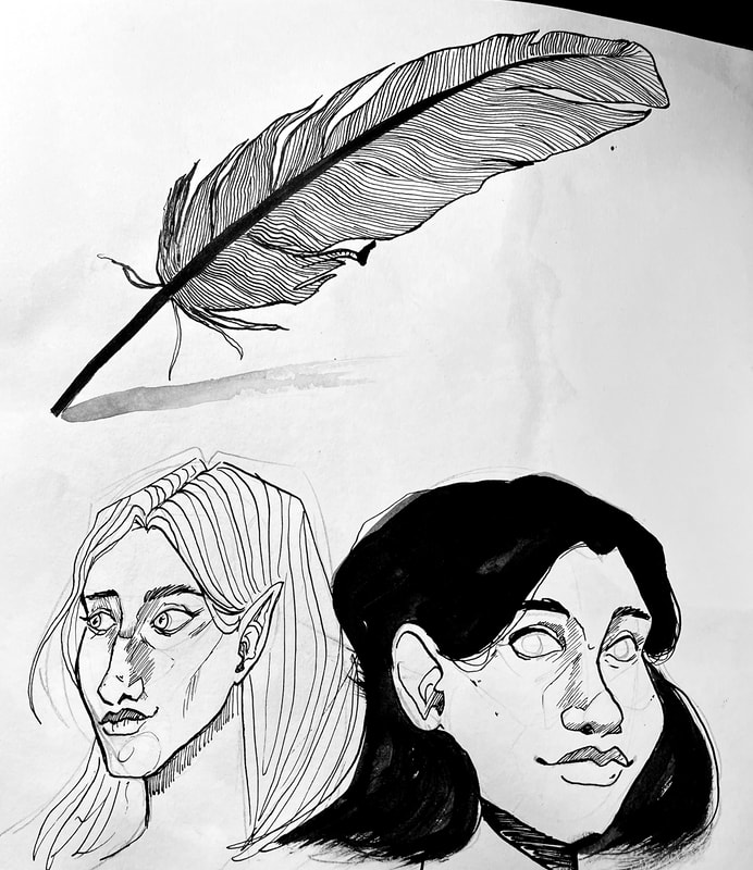
Additionally, I wanted to see how my character illustration style would transfer to inks, I like the effect but I think it could still use some work. |
|
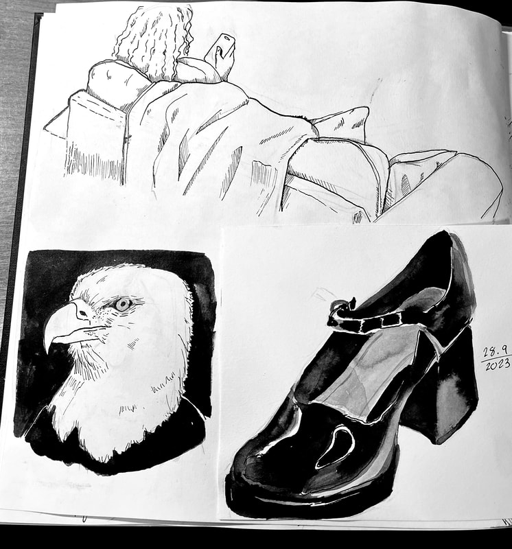
I wanted to see how challenging it was to draw a shiny item, I set up a ring light and placed a show in the light. I started off by inking the outline and the highlights. Doing this helped me to refine the highlights and make them stand out more. I had to make sure that the object looked 3D and to help do this, I worked with diluted ink to layer up the shades to help build up the tone.
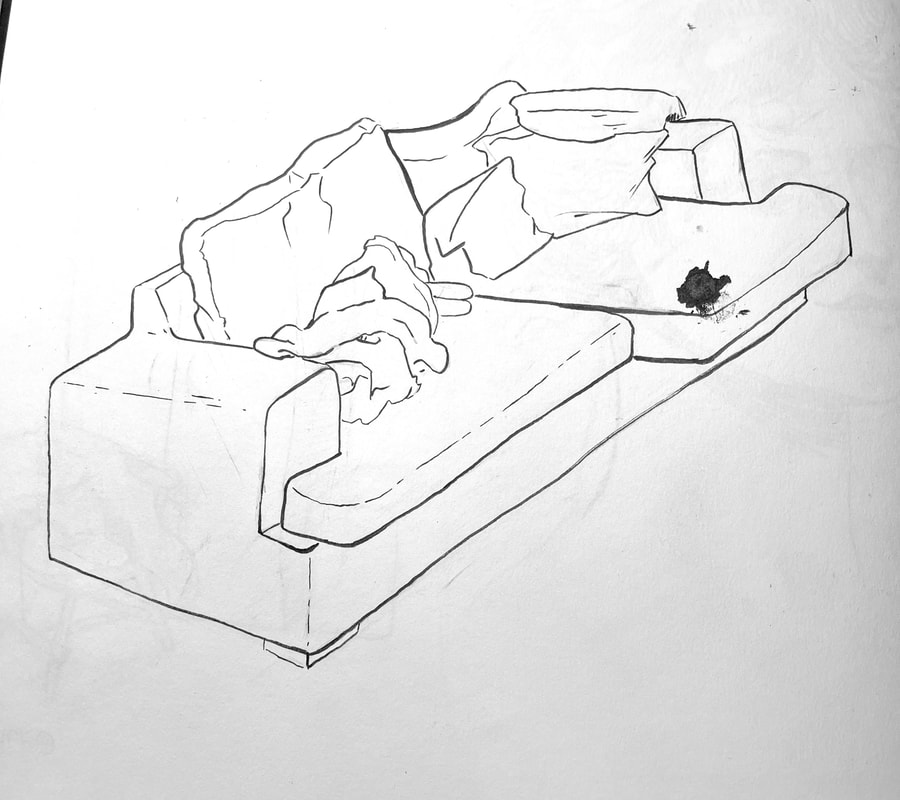
I also continued drawing my surroundings in a different setting, I wanted to be able to draw my friends in situations so I sat on the other side of the room and began to draw what I saw. I had decided to try and see how simplified I could draw them whilst still having it look like them. I believe that I managed to capture their likeness despite the simplified style. |
Above-
Throughout this project, I was inspired by the work of Charles Dana Gibson. I wanted to learn how to make clearer hatching like in his work, so I worked on another self portrait where I Used hatching to help make the shape of the face. I really enjoy the way that Gibson shades his noses and I tried to reflect that in my own piece.
Afterwards I worked on another still life and drew the pot of coloured ink that was sat in front of me, once again I wanted to use the hatching to build shape on the object.
I was inspired my an image on Pinterest and tried to recreate it, I wanted to see how effective the use of stippling could be. I think it was quite effective in the end, however I found it to be a bit time consuming in order to make it look as good as I wanted.
Below- Timelapse of me illustrating my self portrait.
|
I had decided to try and replicate a Gibson piece to help understand his style. I think that I could have made the image larger when drawing to help the detail show through more with the inks. It isn't a perfect copy of the original image, however, I am still proud of the drawing I did. I think that I still need to work on making the hair darker, to do this, I will have to make the hatching closer together to achieve those darker colours.
|
Finally for this project I had to create an Inked illustration of my room. I found this challenging as I had to figure out how to use hatching to create tone and variation with my lines.
Site powered by Weebly. Managed by 34SP.com
