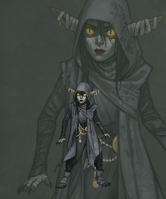
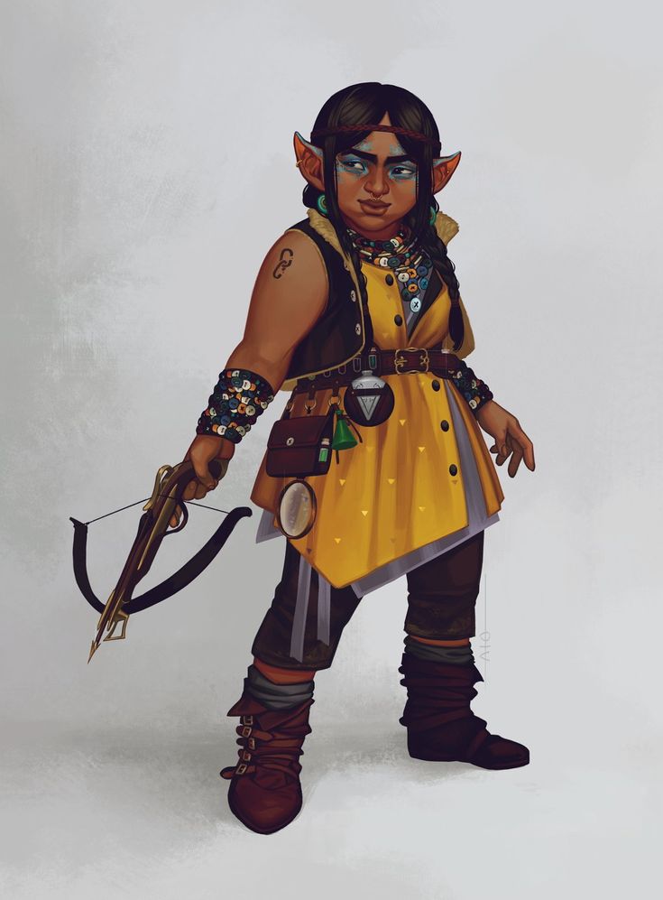
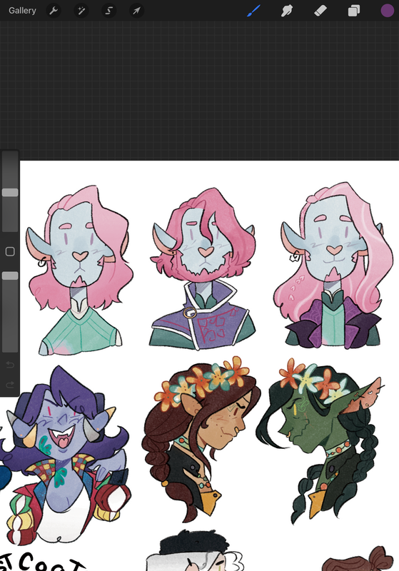
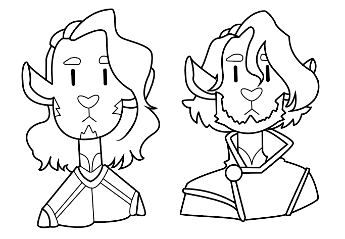
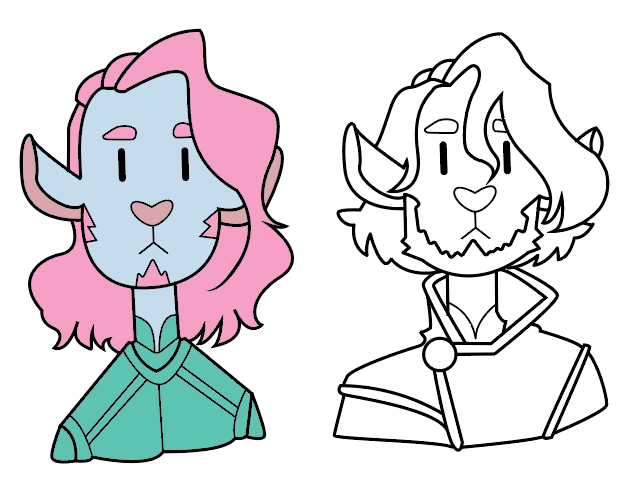
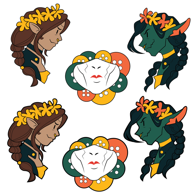
The first character I wanted to work on wad Nott the brave ( Veth Brennato) I wanted this set of pins to show her transformation throughout the story. I also wanted to create some pins based on Caduceus Clay to show how he changes throughout the show as well. I chose these characters because of their unique colours and features, I wanted to see how easily I could recreate them.
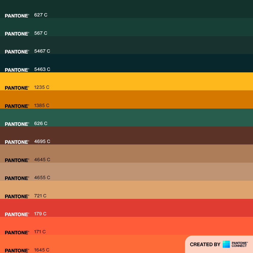
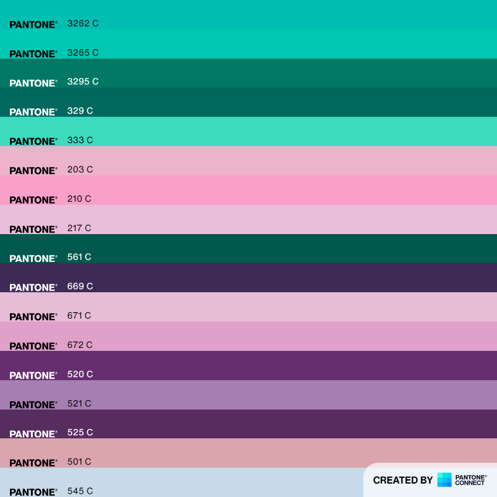
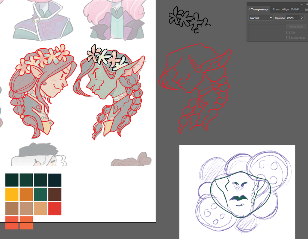
I started off by sketching my basic ideas out on my iPad, with this I could find the style more easily. I then went onto finding some pantone colours that matched the ones I had previously chosen. When working in Illustrator I began work on the Caduceus design but I found that I preferred how dynamic the Nott pins looked and decided to work on them further.
I lowered the opacity and locked the image of the original drawings so that it wouldn't more whilst I was working. I then used the pen tool and worked over the top of it. I enjoy the way that thew lines turned out and I like the way that I was able to make the pins look like a pair. Next I had go figure out another pin that I could design to make a set off three. Throughout the show, Nott can be seen wearing a porcelain mask so I decided to make that another pin,. additionally, I decided to add in her love for buttons in the background to help show off some more of the characters personality.
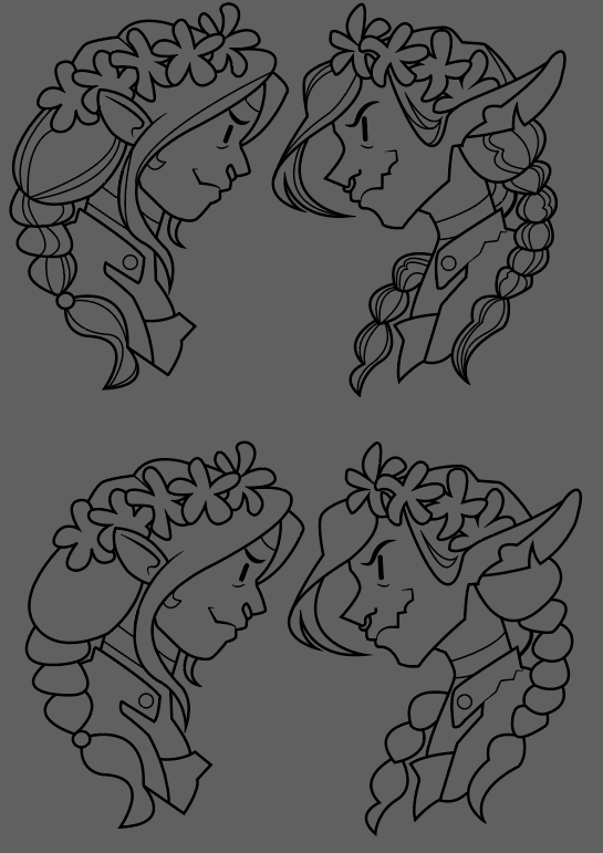
When doing the line art, I made sure to create one detailed one and one simpler one, this was because if the pins were to get made there needs to be enough room between the lines for the colour to fill. One challenge I found was narrowing the colour scheme to 4 Pantone colours. I decided to work with 4 colours per pin whilst still keeping the colours similar throughout them all. I wanted to pins to clearly be a set. I also worked on making the lines on the outside thicker, this meant that when placed upon a background you can easily tell the difference between the two.
Above- without the outline
Below- With the outline
Below- With the outline
When it came to the background, I decided to use buttons again. Once I had the design, I decided to play around with different colours to see which ones I preferred.
Final Pins
Site powered by Weebly. Managed by 34SP.com
