My Inspirations
|
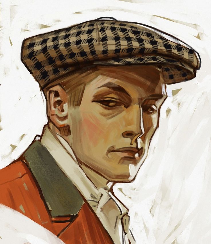
I enjoy the work of Leyendecker because of the way he stylises his portraits. With the image above, I like how line art is used to help emphasise angles, I want to try and find a way to use this within some of my work.
|
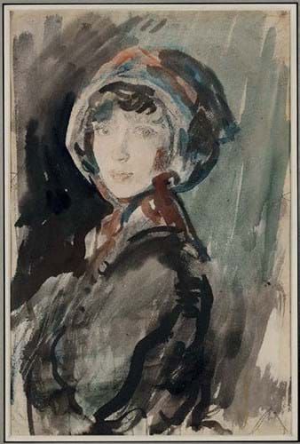
With McEvoy's work, I enjoy the detailed faces in contrast to the simplicity of the rest of the illustration. The limited pallet also interests me as I would like to find out how I could use a limited pallet to my advantage.
|
|
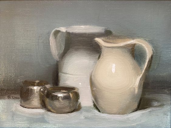
In Ewan McClure's still-life's the edges on the objects aren't crisp, they are quite soft. I want to try and replicate this in my acrylic work, I want to try and keep the silhouette of the object there whilst not being as crisp.
|
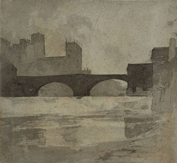
In contrast to how I feel about McClure's work, I like how Cotman is able to get flat crisp colours and shapes throughout his work, especially with watercolour. I want to get better at this as with watercolour I tent to work with softer edges and more washes.
|
Acrylic
|
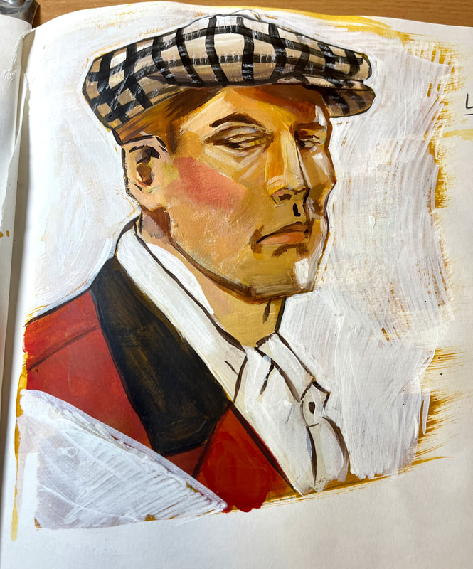
My attempt at recreating Leyendecker's illustration. I found this challenging as I couldn't seem to get the colours to work how I wanted them to. I was also struggling with the Line art aspect of the piece as I didn't have a small enough brush to make the lines that I wanted, also they didn't come out as crisp as I had wanted.
|
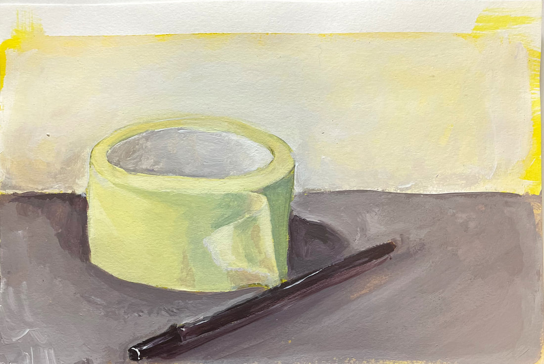
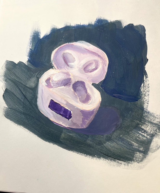
With the still-life's I wanted to try and get the soft edge effect that I had seen in McClure's work. With these pieces, I also tried to work in just a few colours, these being the primaries, white and the occasional brown.
With this still life I was experimenting with how to mix a grey and a black without the use of black. To do this I worked with mixing the primaries to achieve a dark shade, I then used this to help give off the impression of the colour black.
|
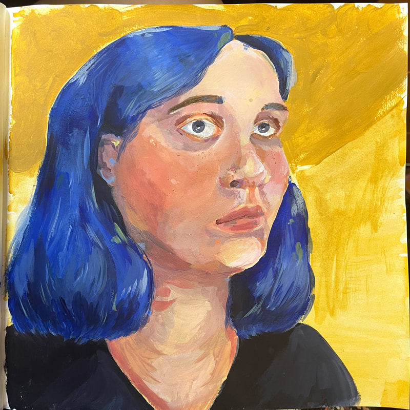
Finally, I went onto a self portrait. I wanted to try and use some of the skills I had gained from some of the pieces that I had done and transfer them into this work. One thing I found challenging was mixing the correct skin tone with the colours I had available. I had originally made the skin too yellow so I added in more red to try and fix it. Getting the colour right on the face took the longest as I kept going back over it to make it look as good as I could get it. Throughout the drawing, I also wanted to find a way to not have my hair look out of place, to help with this I placed buts of blue throughout the piece and I also made sure to mix a small amount of it into the other colours to make sure everything was cohesive.
Watercolour
Watercolour is one of my favourite materials to work with, I wanted to use this brief to help further refine my skills and see where I need to improve.
|
I enjoyed working with the limited colours. In the end I only used 3 with the main focus being on the use of Payne's Grey. I think that I could have put a bit more expression into the piece with the brush strokes, however, I am still happy with how the study turned out.
|
This was only a small, quick study. I didn't manage to get the crisp flat colours I was hoping for. If I had a bit more patience, I would have been able to get the crisper edges and flatter colours that I was hoping for.
|
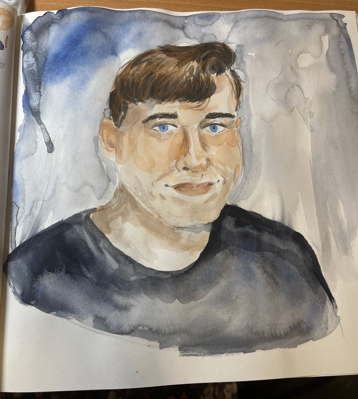
I decided to create a portrait from a photo I already had. The challenge I had with this piece, was trying to get the face to look correct with both the sketch and the colouring. I worked with light washed to help build up the shape of the face and worked with mixing a range of shaded to help bring out some more colour within the face.
|
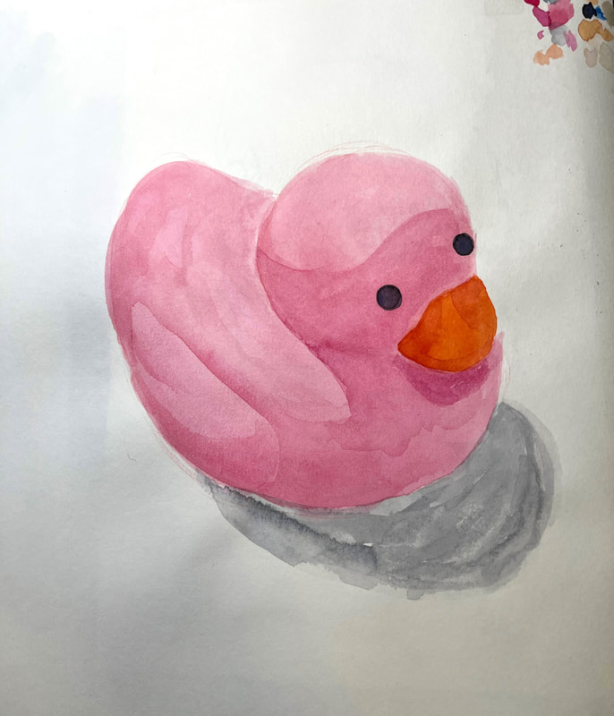
I wanted to have another try at getting some flatter colours with the watercolour, so I decided to draw a rubber duck that was on my desk at the time. I took my time and tried to get the base colours as flat as possible and then waited for it to completely dry before adding on some shading and other details. I enjoy how I managed to make the wing stand out and look 3D without the use of Lineart
|
Site powered by Weebly. Managed by 34SP.com
