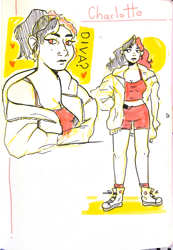
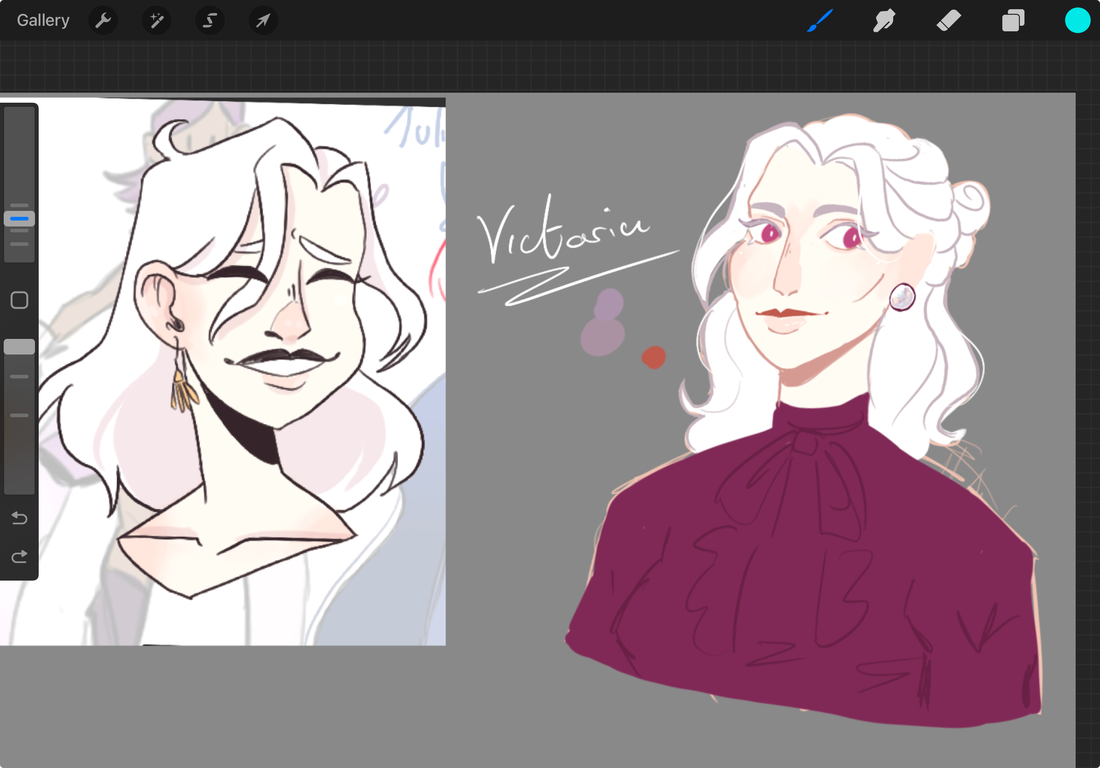
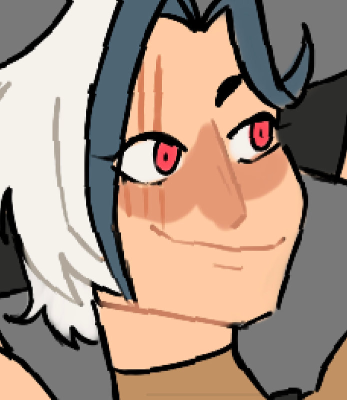
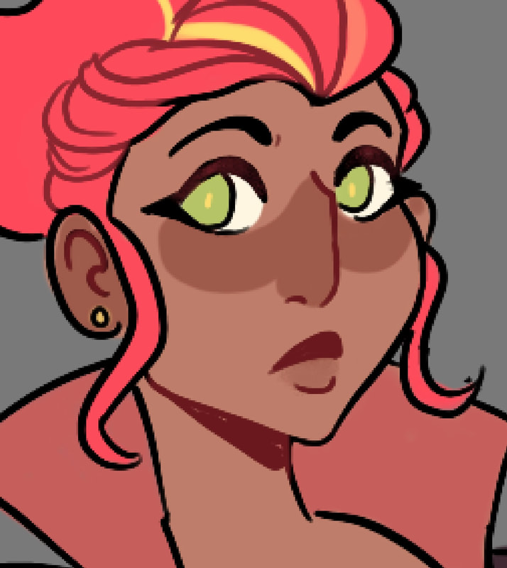
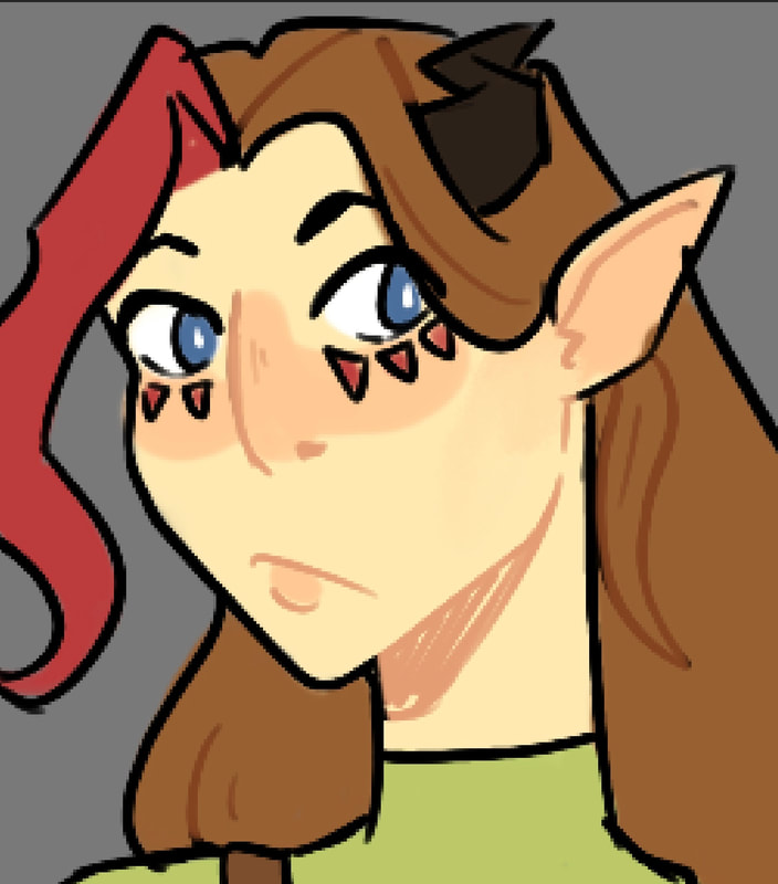
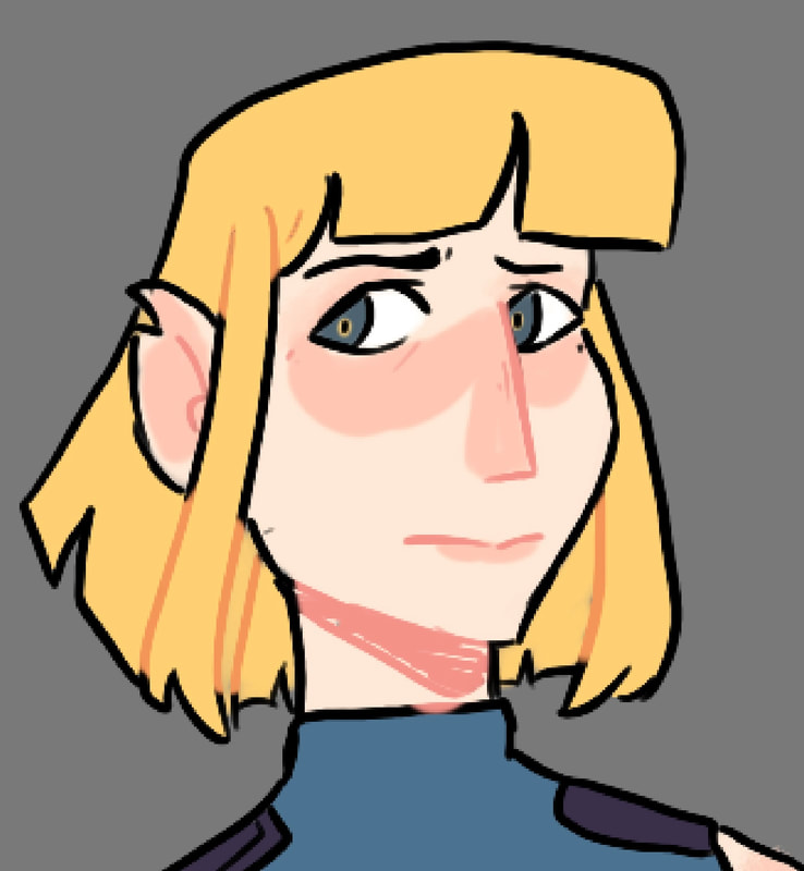
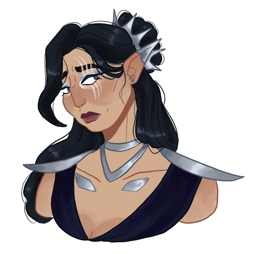
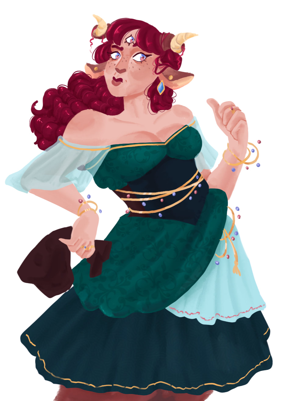
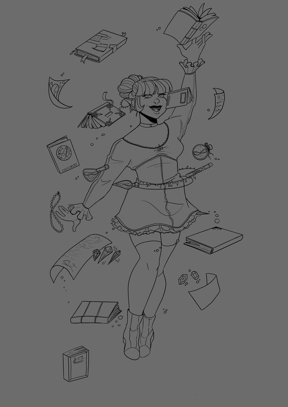
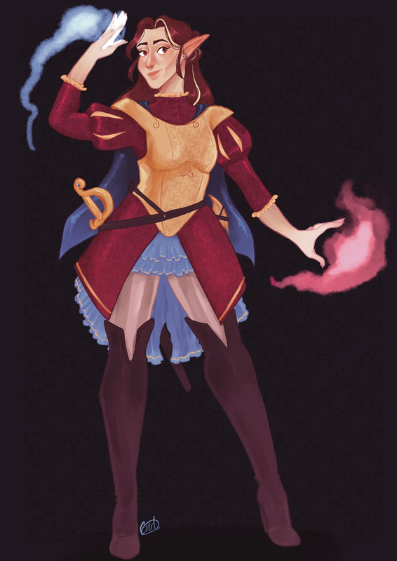
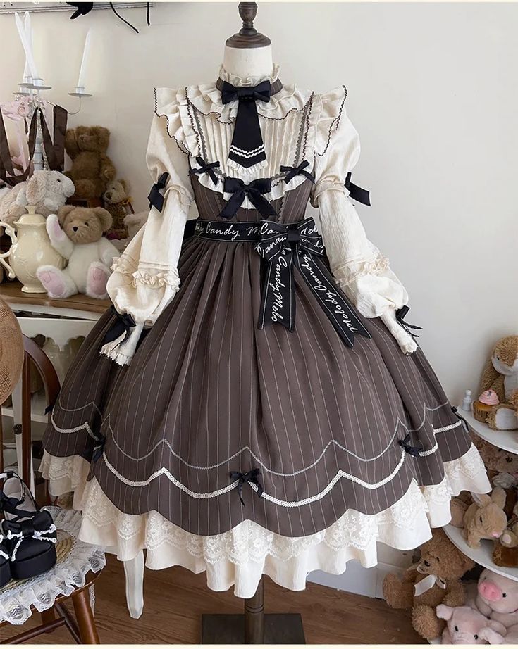
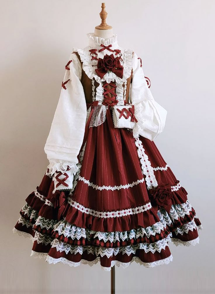
For this mini project, I have chosen to develop my personal illustration style through character design. Character design has always been one of my focuses when it comes to illustration, it is what got me into it in the first place. I enjoy trying to make them all unique within their worlds and push their designs to mimic personalities and traits.
The characters I will be working one will come a number of mini personal project. My main goal is to stretch each character out and make them as unique as possible, whilst staying within the themes of their world. I want to be able to fight the 'same face syndrome' that I used to have when drawing my characters, no matter what I did all of them looked the same.
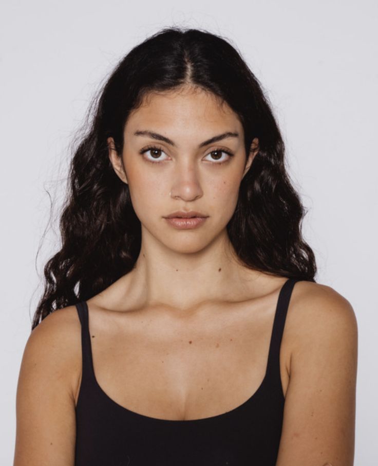
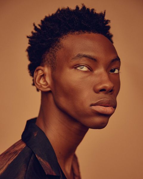
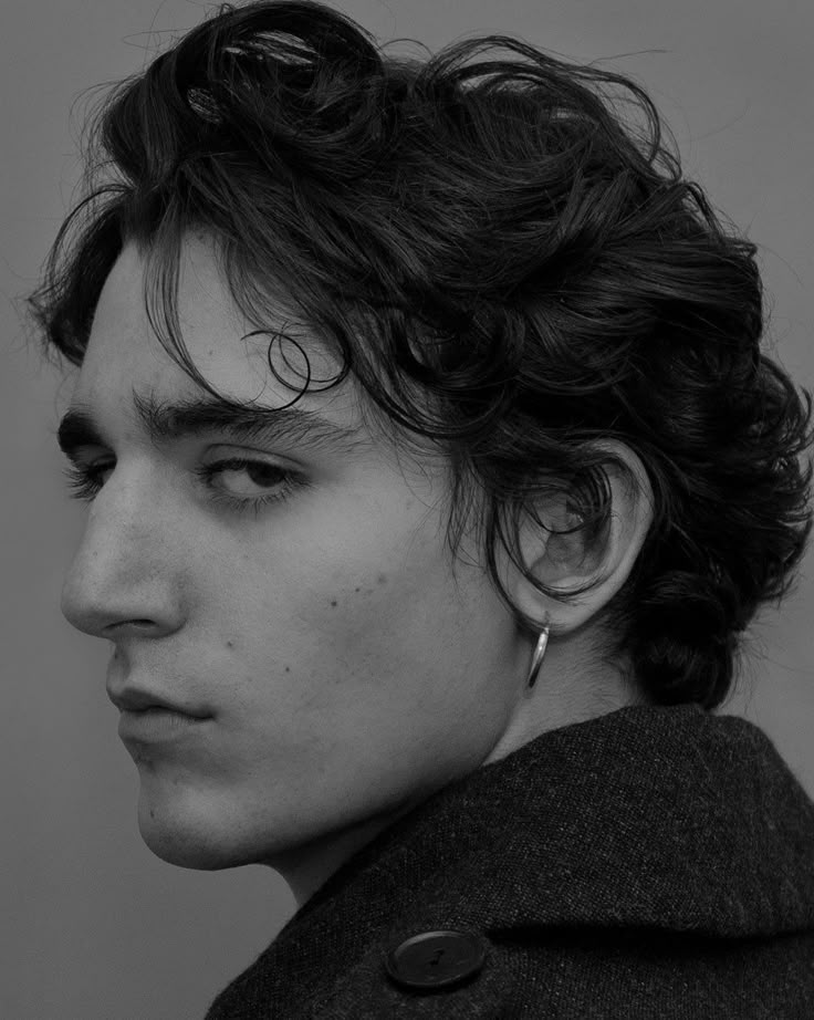
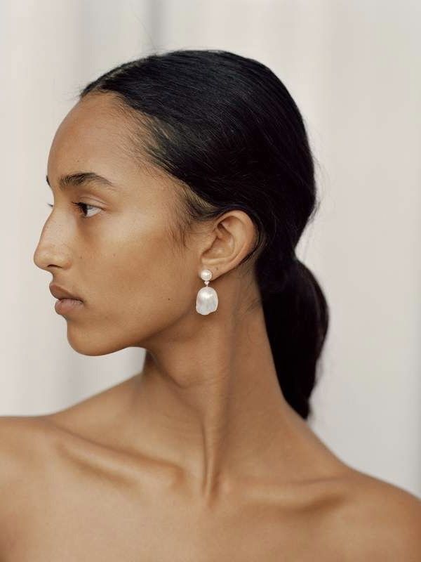
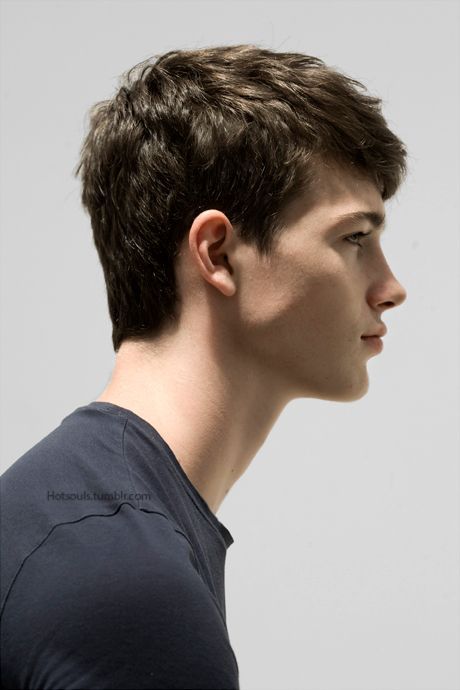
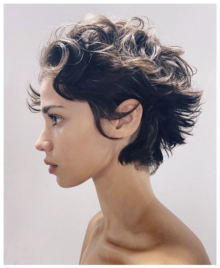
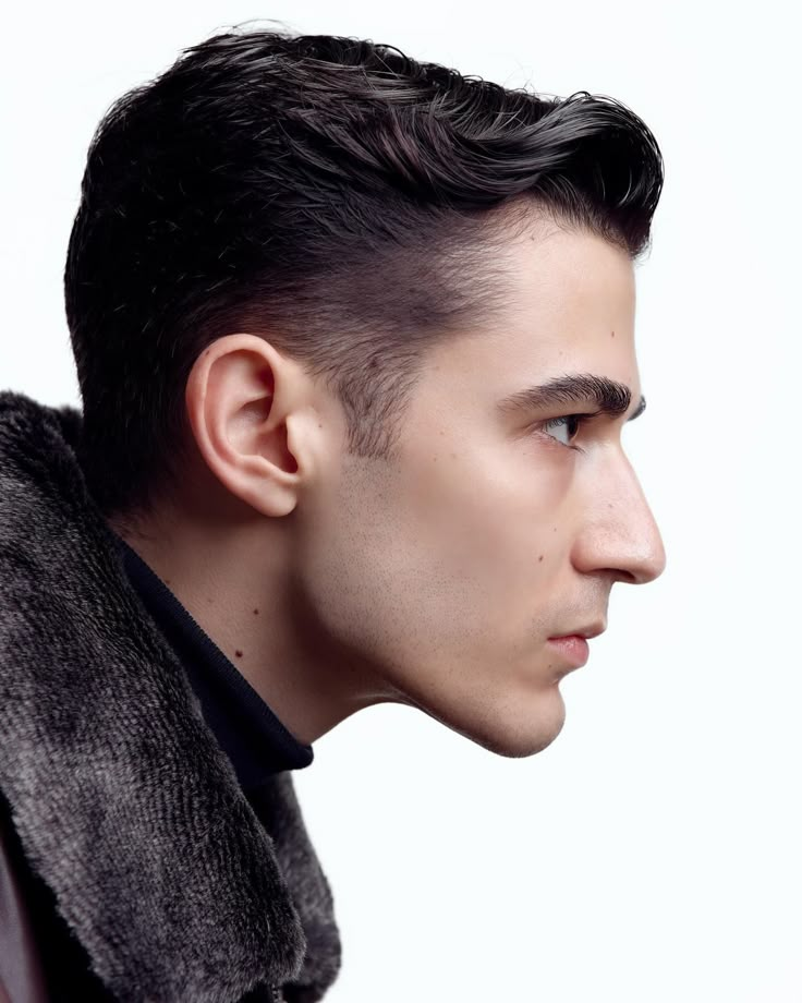
Everyone is different
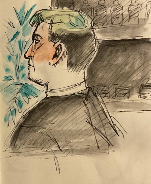
no one in this line up looks the same, they all have their own unique features that make them who they are. Everyone's face has different shapes within their features , how do I transfer this onto my work ?
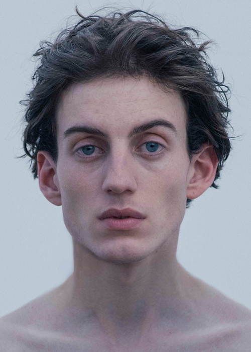
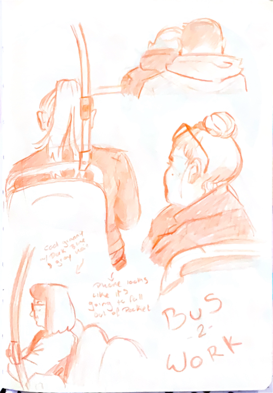
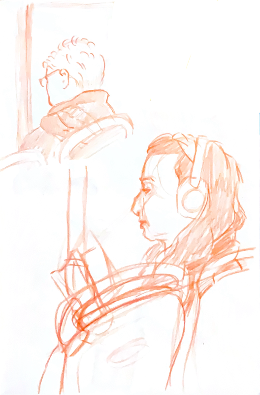
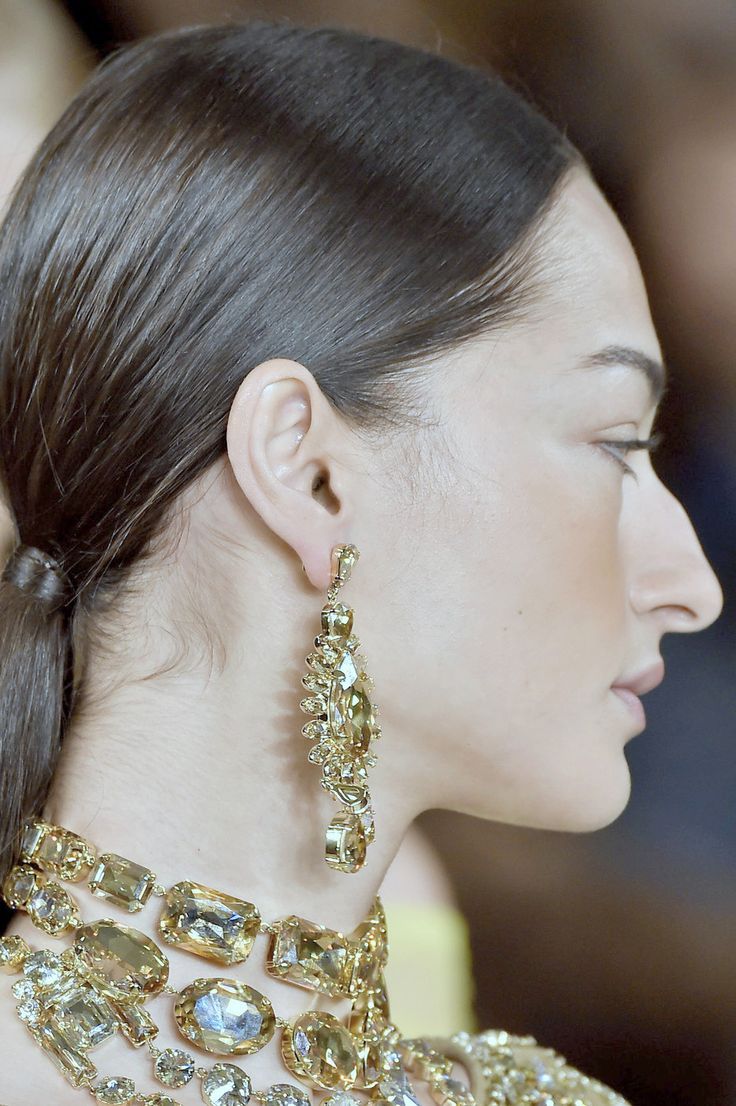
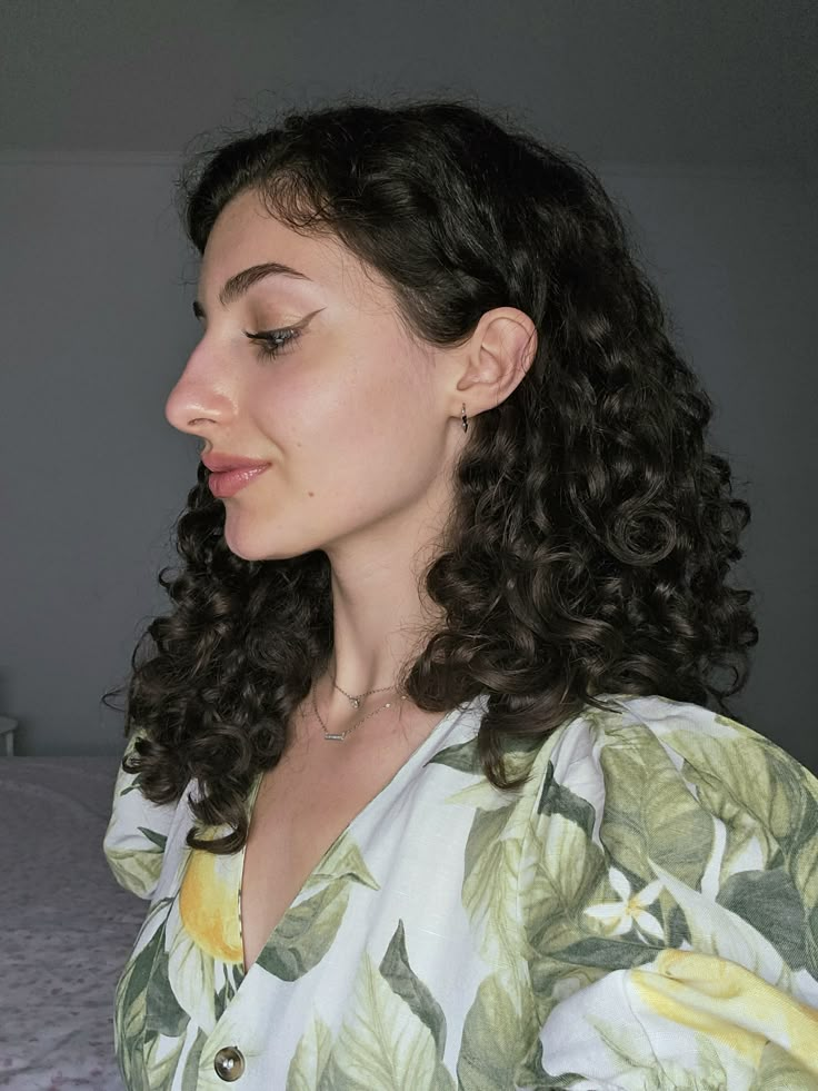
what do people look like?
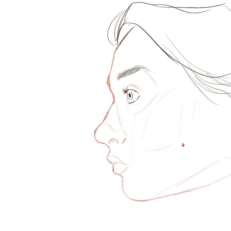
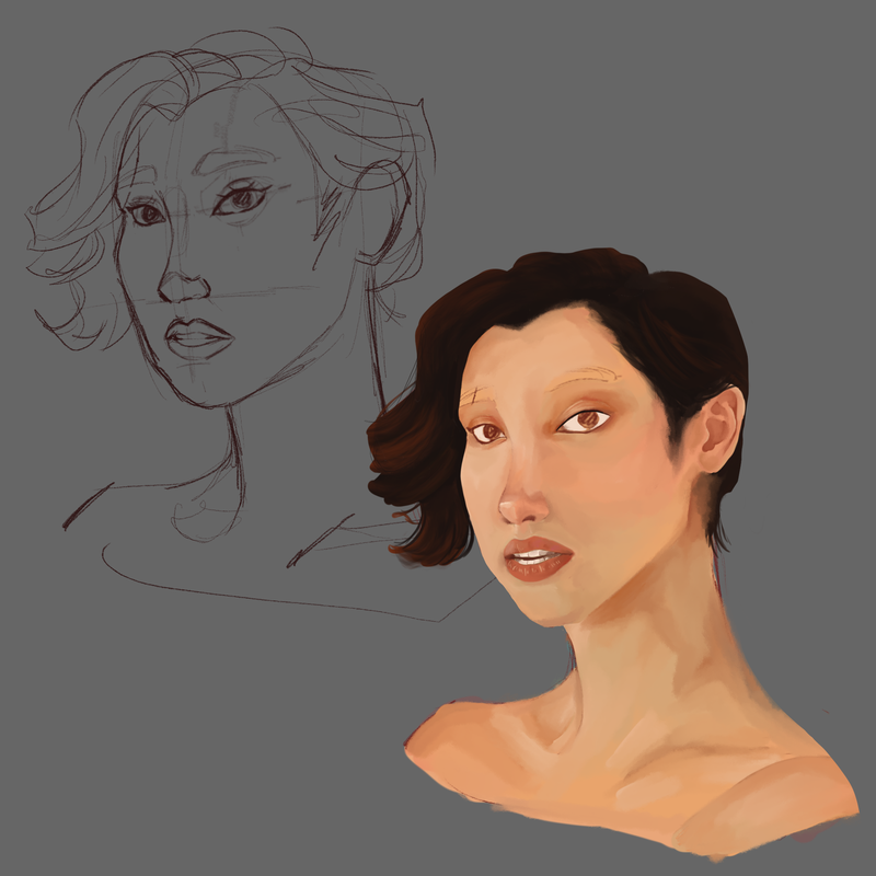
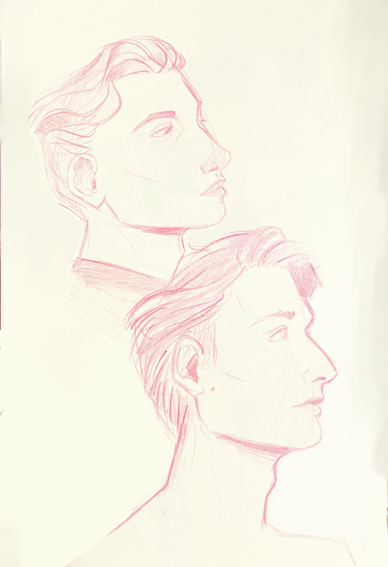
From these studies I have found that for my character illustrations, I should work with new nose shapes and bring out other features like the cheeks or chins.
old to new
|
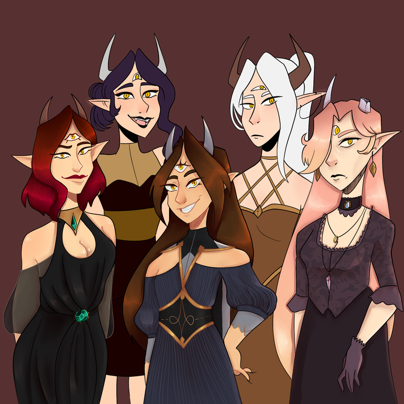
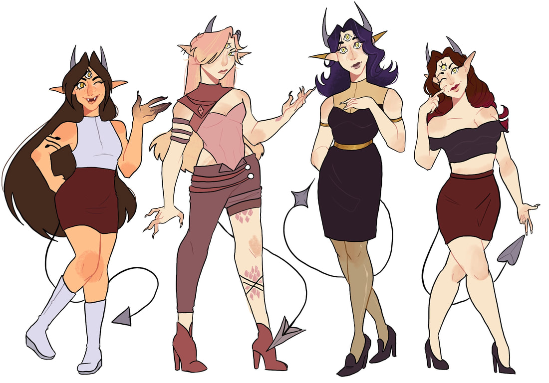
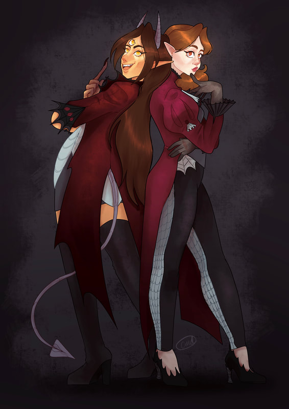
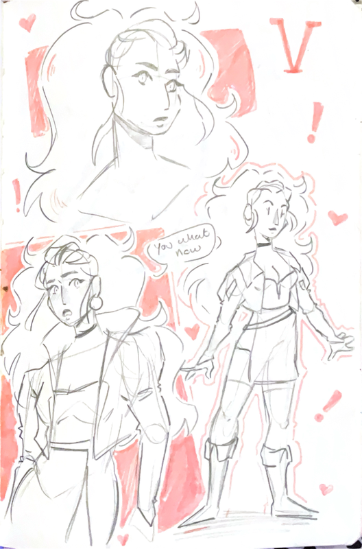
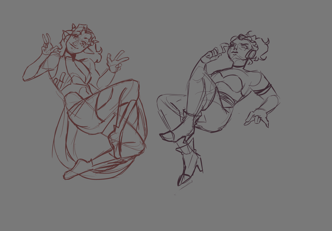
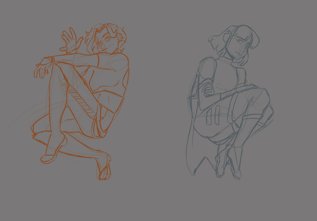
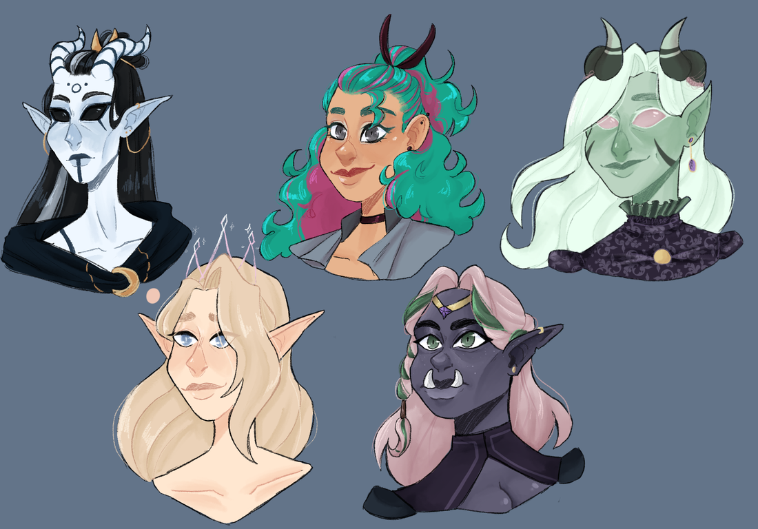
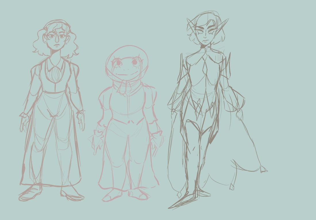
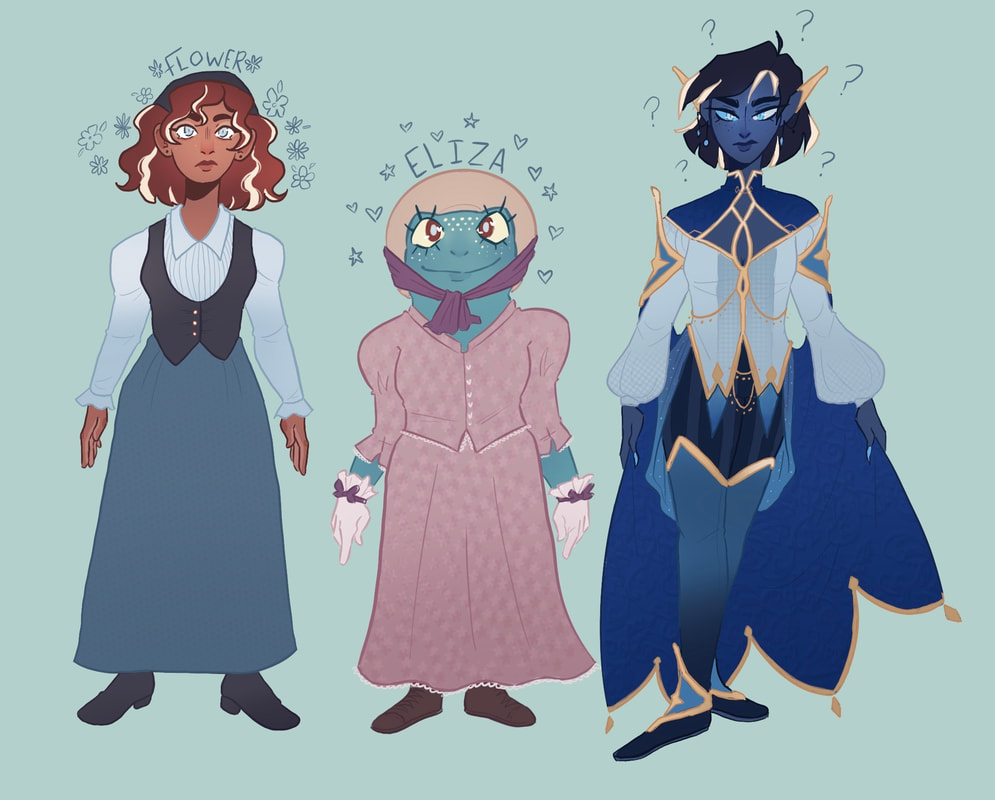
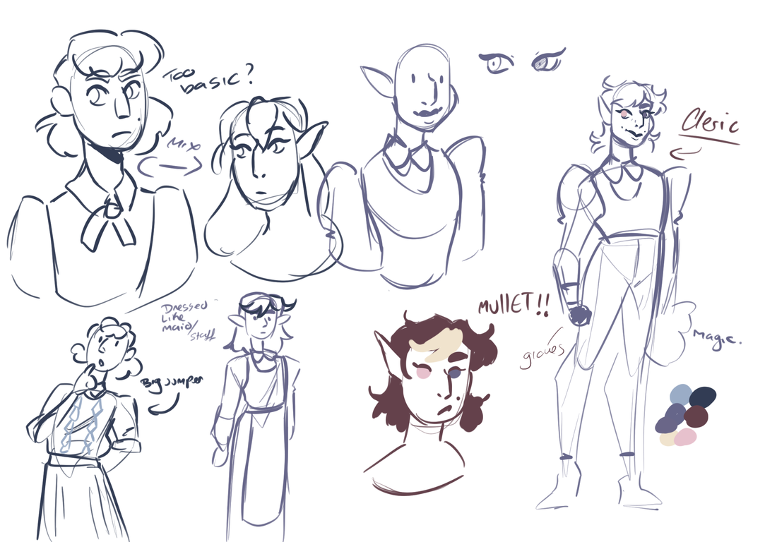
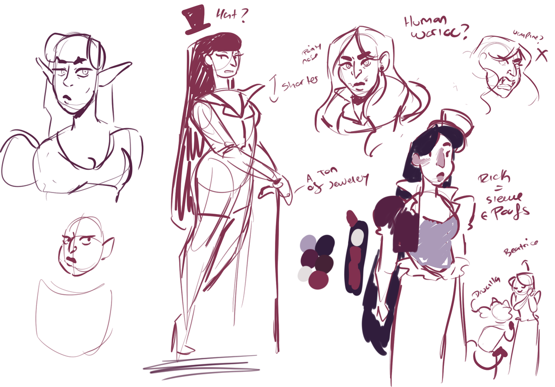
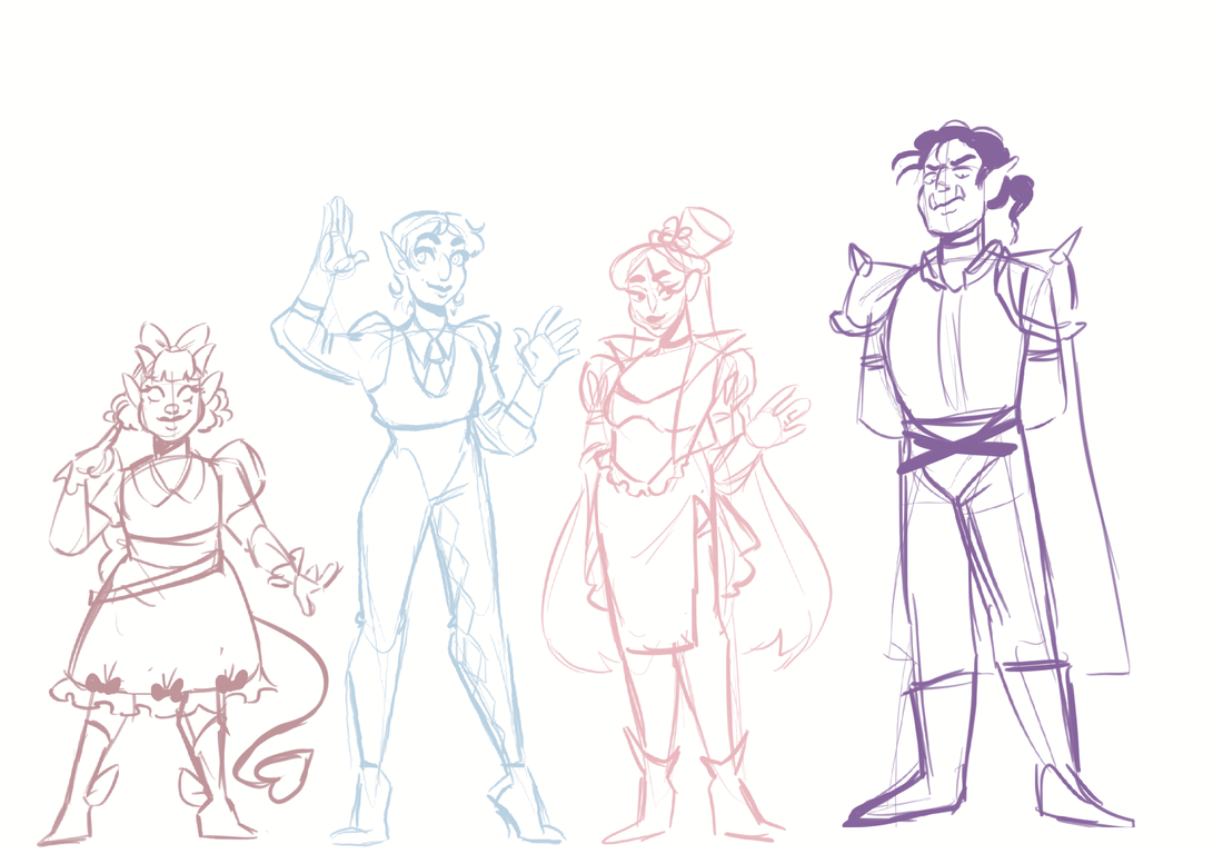
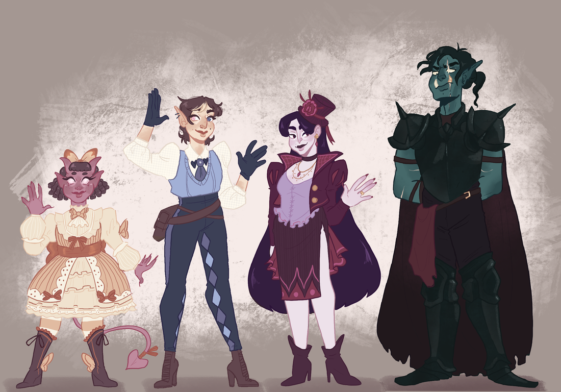
Going back to this illustration from earlier, I decided to take these characters and work on them with my newer understanding of the face. 3/4 of these characters on the bottom image are related so I wanted to keep a few things similar between them, like skin tone and eye colour. I wanted to be able to show off more of their personality through body language and how they dress and present themselves with their body language.
|
WHY DOES EVERYONE HAVE THE SAME NOSE
|
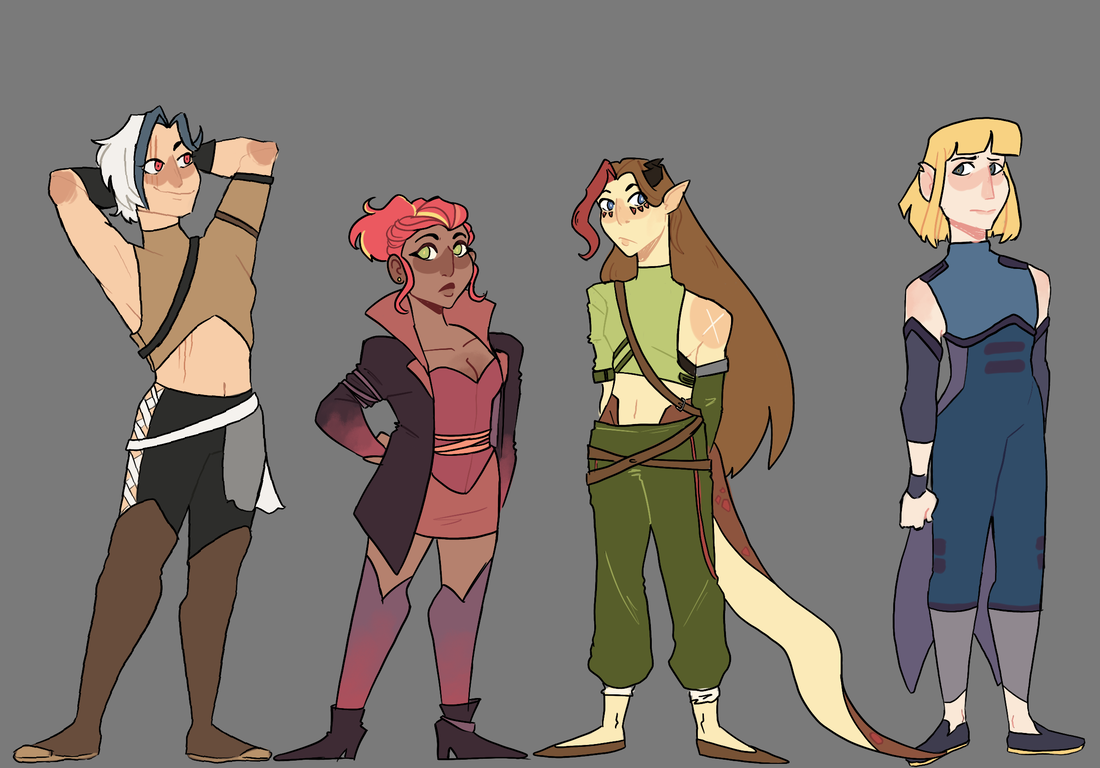
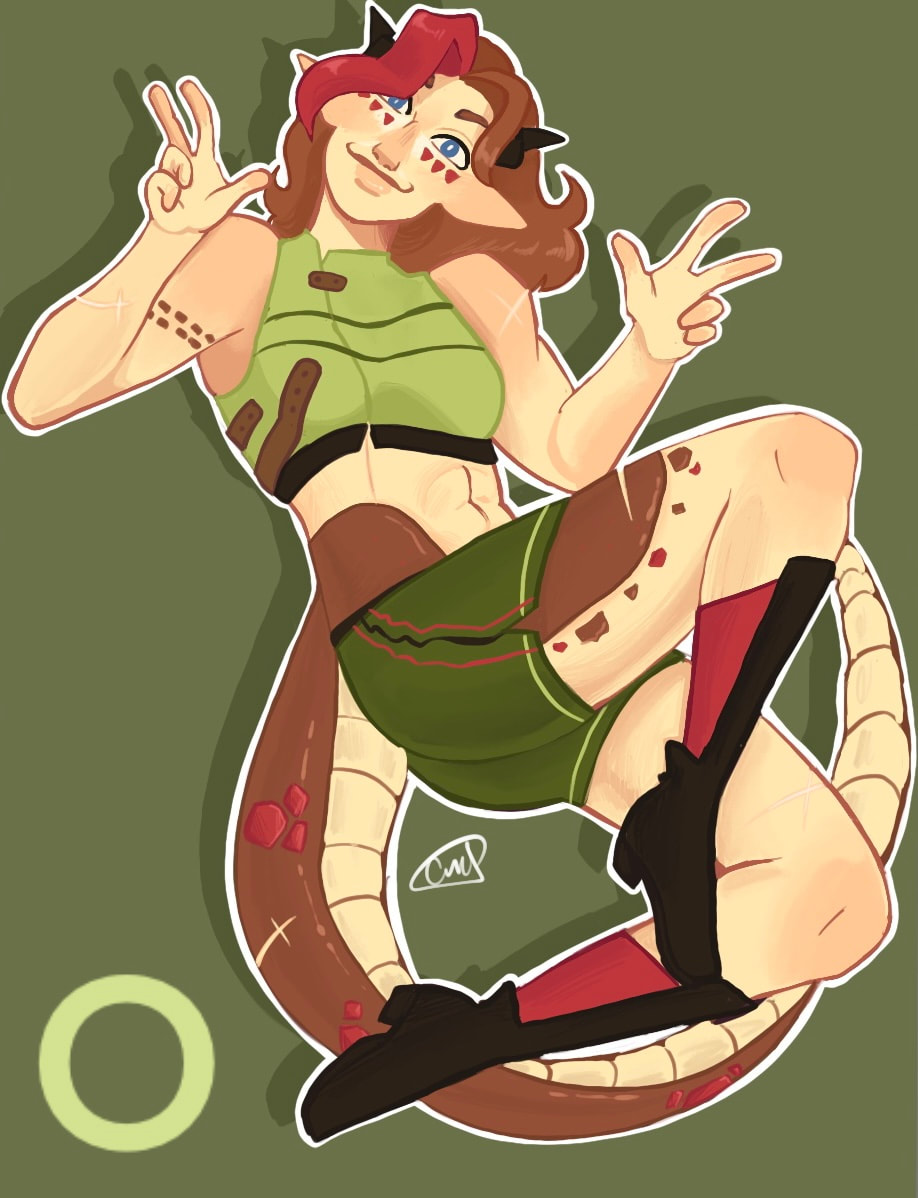
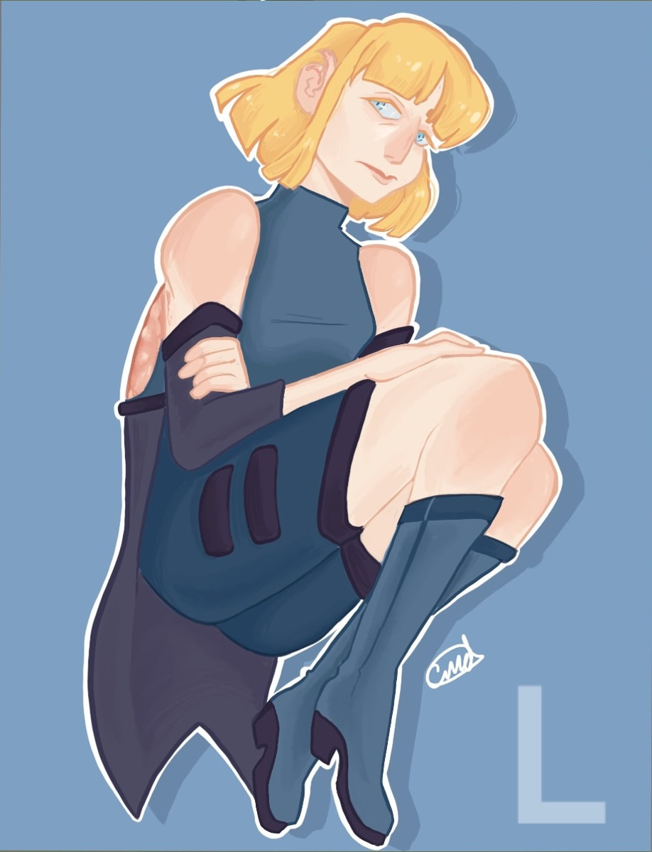
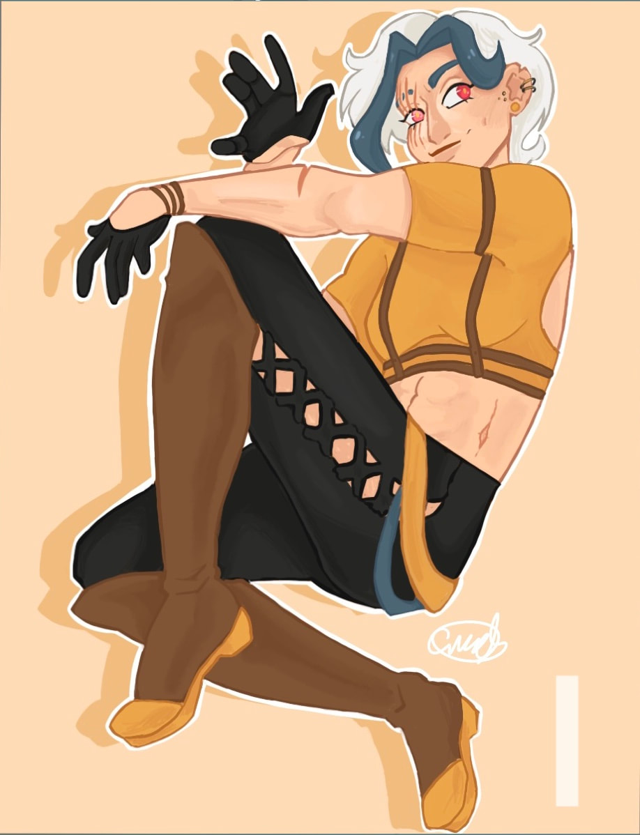
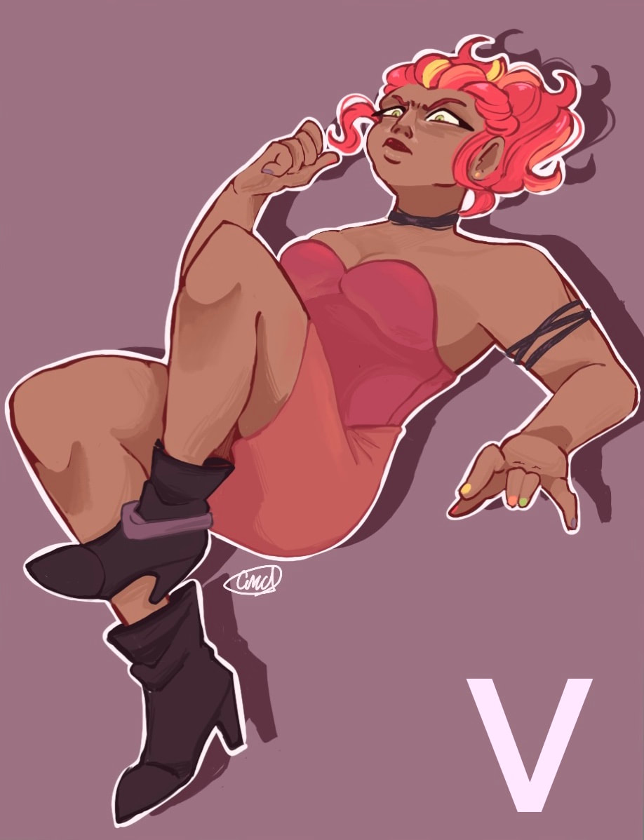
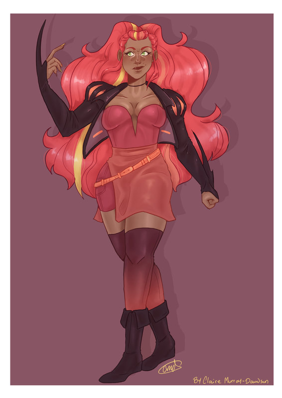
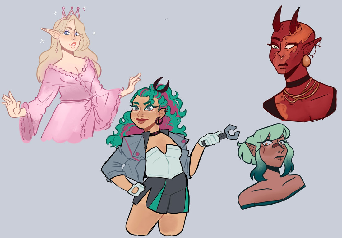
This group of characters were drawn in 2018/2019. At the time I was really into an animated show and wanted to see if I could create some characters based of some of the themes from the show.
Back then I was too focused on the overall colours and outfits being different and never thought about expanding the features of each character. |
none of these 4 people have the same nose, they are all different people from different backgrounds
All four of these characters come from very different backgrounds and regions, I wanted to try and show this within this line up.
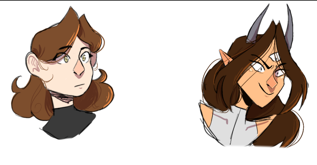
I decided to create 4 solo illustrations of the characters, I believe that overall I could have pushed some of the features a bit more, such as the noses. however, I believe that each character does look unique when placed in a line up against the others.
I decided to create 4 solo illustrations of the characters, I believe that overall I could have pushed some of the features a bit more, such as the noses. however, I believe that each character does look unique when placed in a line up against the others.
How to push character designs - Fantasy worlds
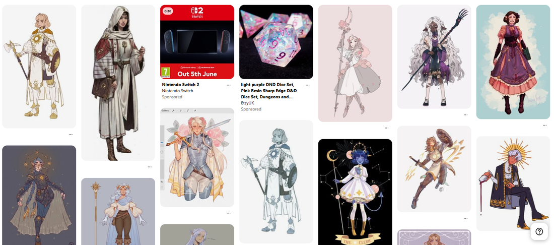
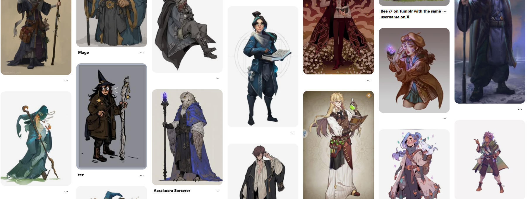
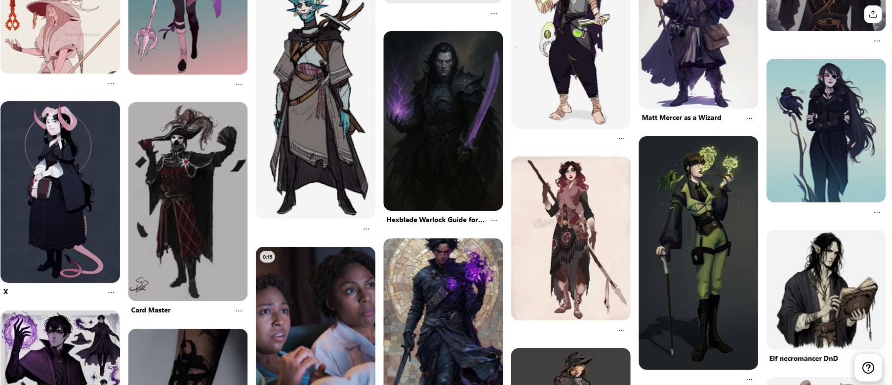
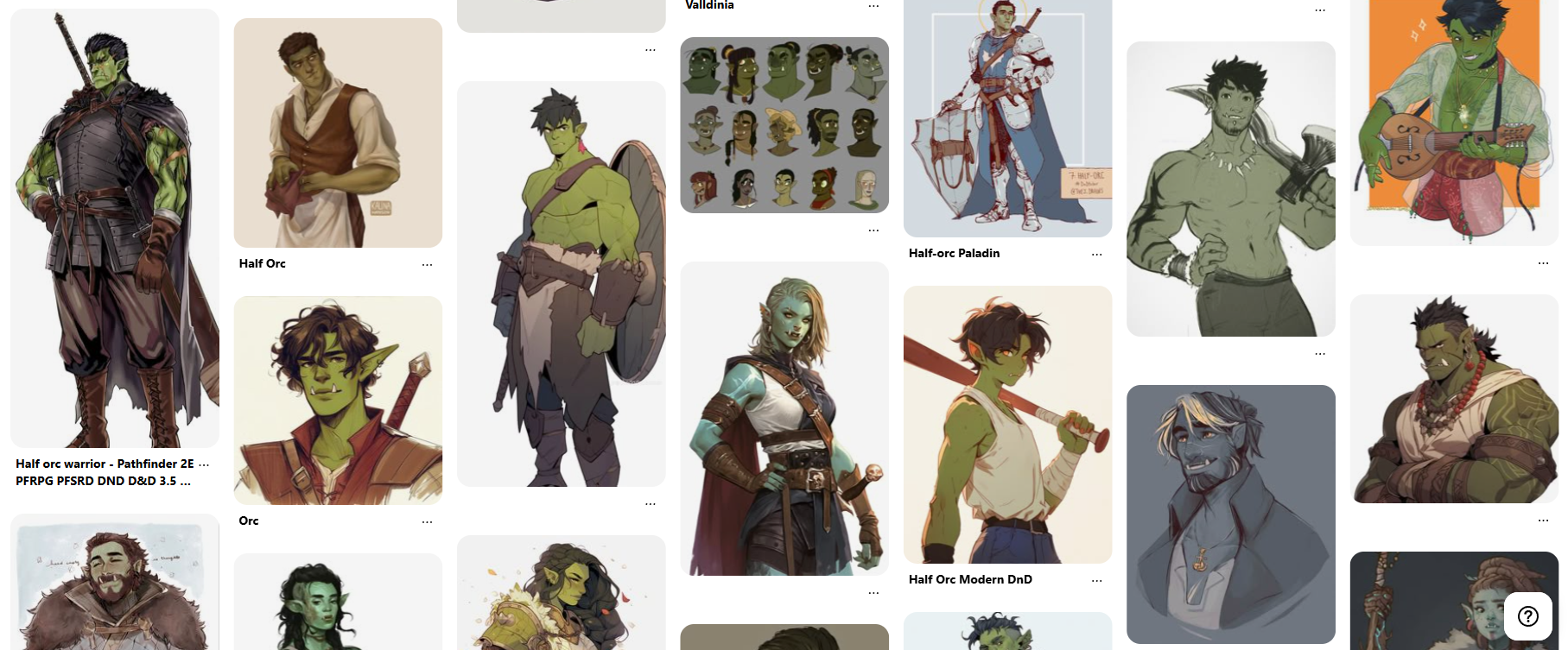
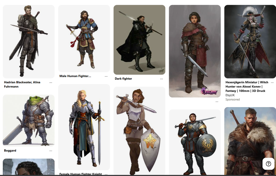
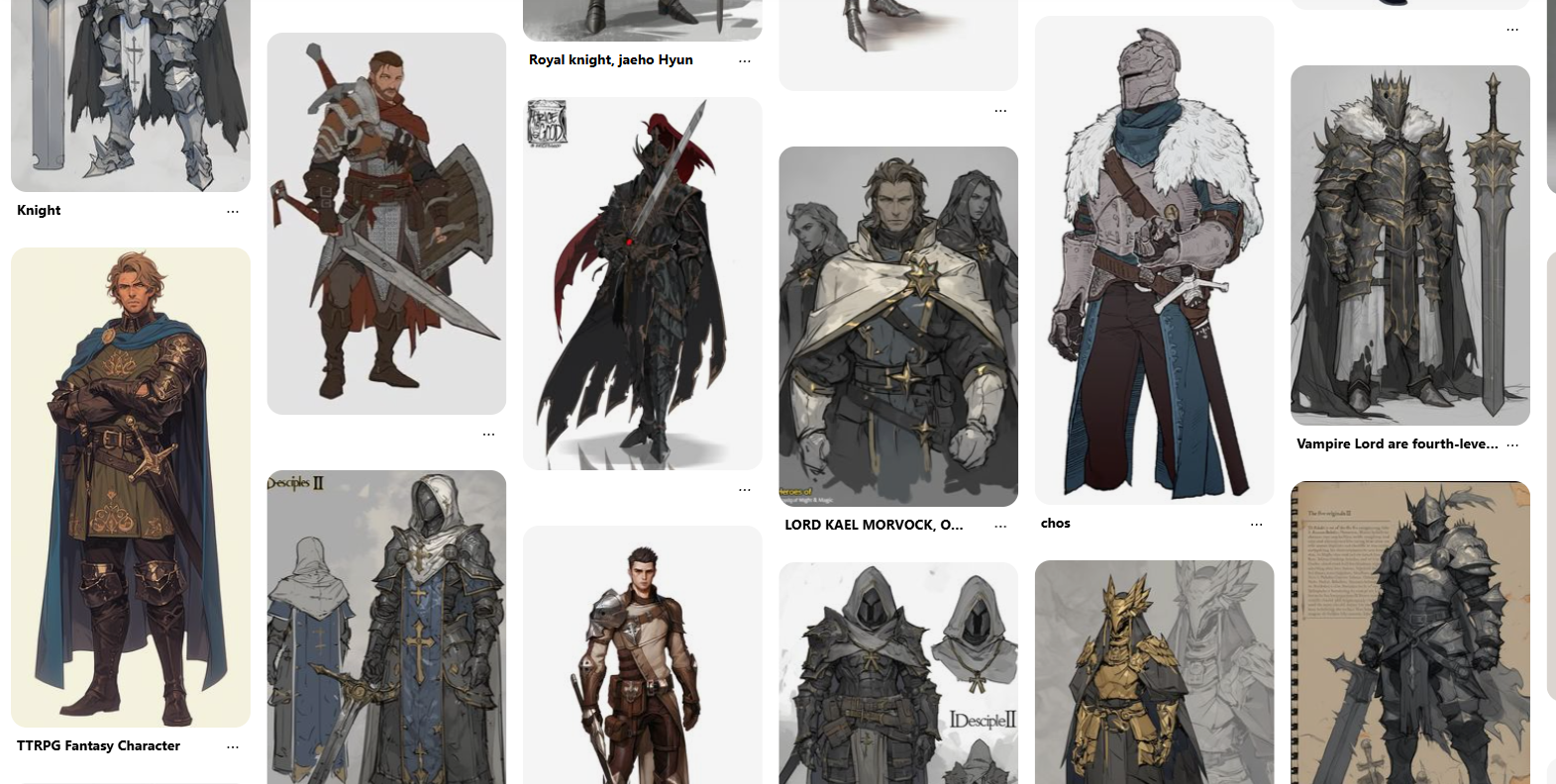
One of my biggest inspirations is fantasy media, mainly dungeons and dragons. I love the fact that your characters can look however you like, there are no limits with DnD character due to the number of classes and species that all have an effect on what a player character can look like.
I want to see if I can take the information that I have learnt from the previous exercises and transfer it onto more unique character designs.
I want to see if I can take the information that I have learnt from the previous exercises and transfer it onto more unique character designs.
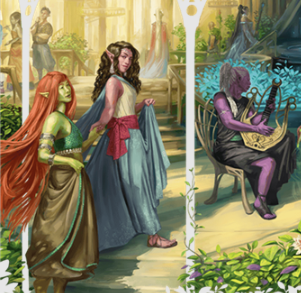
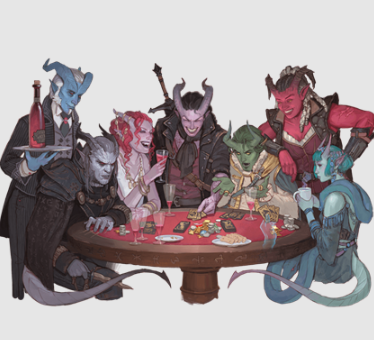
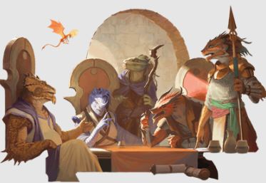
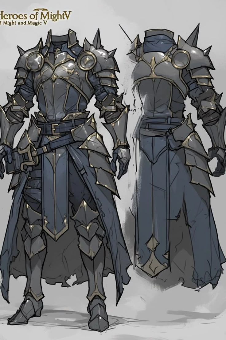
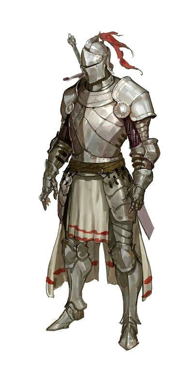
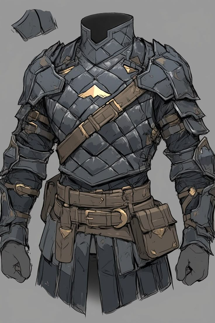
images below are all from official dungeons and dragons resources
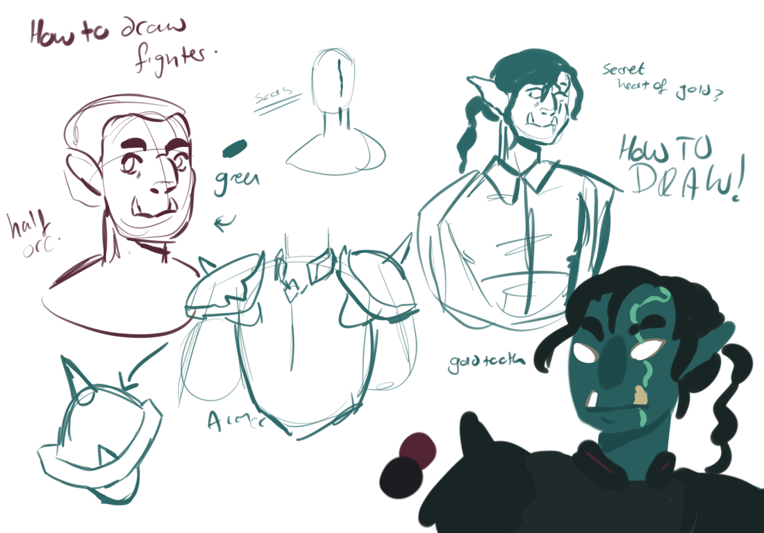
How would I draw these dnd species?
I get my Dungeons and Dragons characters from my ongoing games that I run. Finding ways to illustrate the background characters is really helpful for the game as it allows everyone to see the characters physical design and features.
From working on the previous character work, I have now find it easier to make each character look unique. I work with new shapes and facial layouts to develop the characters look and then go onto clothing and body language afterwards. Building the character like this is really helpful as the more I draw the face, the more I understand its structure and am able to replicate it, additionally I will more easily be able to spot if two or more characters look to alike, meaning that I can easily edit designs.
Designing characters for a recorded session
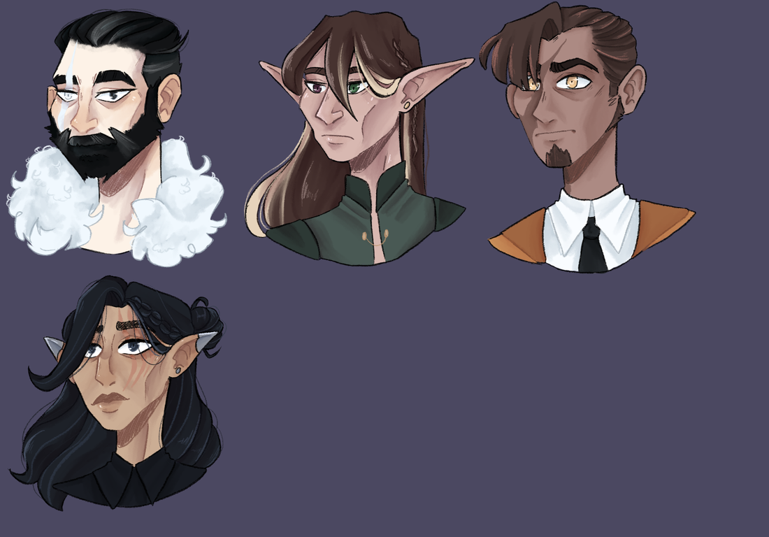
At the start of the yar I was asked to run a one shot dungeons and dragons session to be recorded for a film project, I agreed and started writing the plot of the session. The story was all about mystery, all the characters had no memories and it was up to the players to find out more about themselves. the twist being, they were all related and part of an evil family known for their dark deeds.
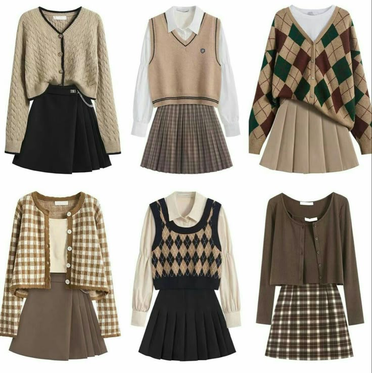
Non of the players knew what there characters were going to look like or what their personalities were, this meant that I had creative freedom with their designs. I wanted a diverse group of characters that could push my style and knowledge that I had learnt from the previous illustration within this project. I wanted to work with unique face shapes, colours and body types, whilst keeping each characters personality showing through.
Non of the players knew what there characters were going to look like or what their personalities were, this meant that I had creative freedom with their designs. I wanted a diverse group of characters that could push my style and knowledge that I had learnt from the previous illustration within this project. I wanted to work with unique face shapes, colours and body types, whilst keeping each characters personality showing through.
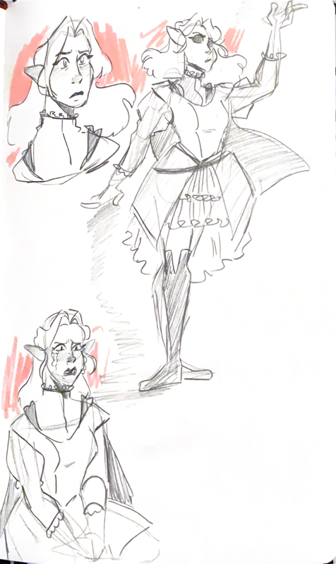
Drucilla - Young assassin child, loves frilly dresses and tearing the head off her dolls.
Medow - outspoken main with a secret power, always follows orders. She only stays for the money
Beatrice - Head of the family, powerful magic. shady deals
Kevdall - warrior, strong and scary with a secret heart of gold.
Final designs
Creating my own fey deities
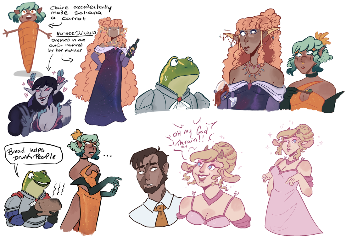
A big part of my dnd campaign is the feywilde, a alternate plane filled with fairies and powerful magics. I wanted to create my own group of fairies that would work alongside the main cast of characters within the narrative. The fairies I have created are a small family, a mother, father and their daughter. For this part of the project I will be trying to make the designs cohesive enough to look like a family whilst keeping their own personalities showing through in their designs.
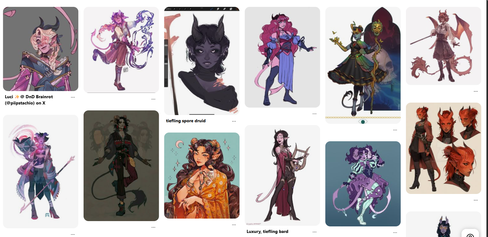
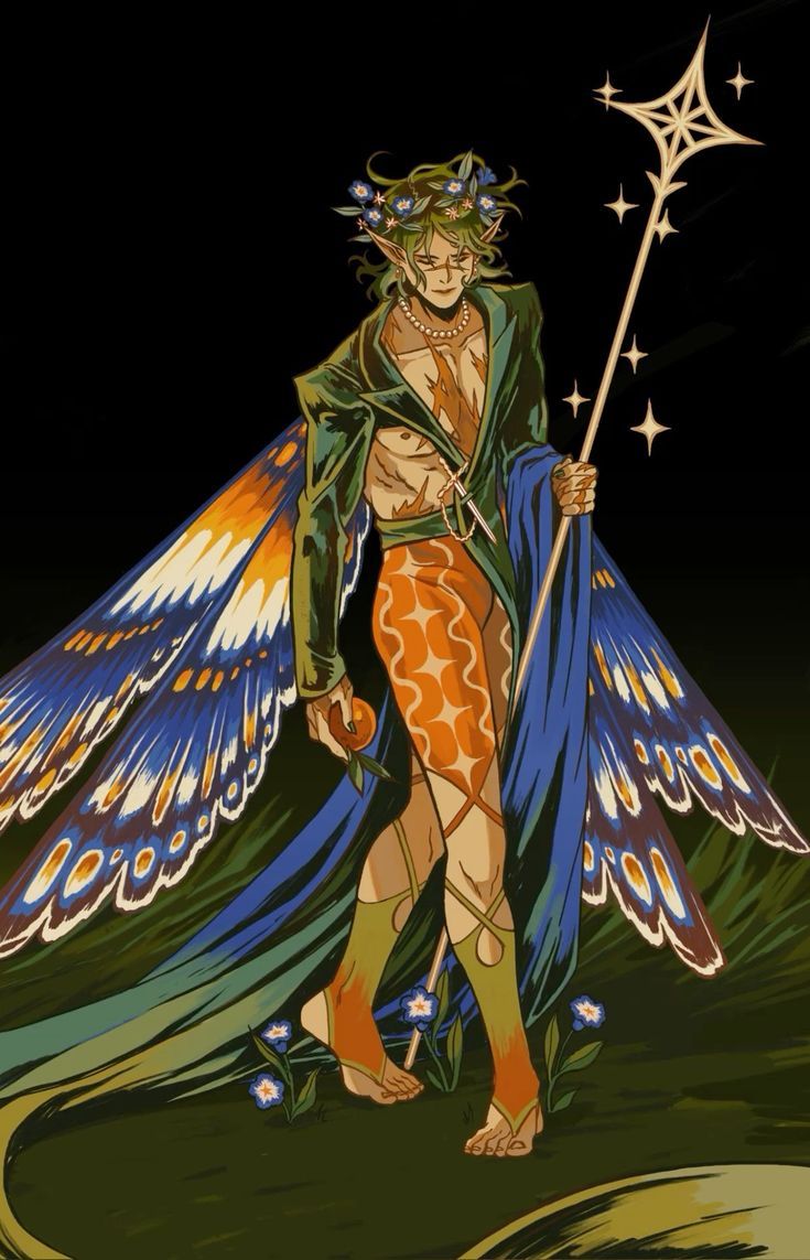
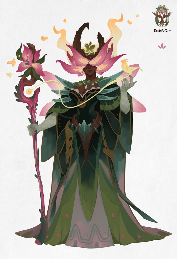
Here are some examples of other artists Archfey designs.
|
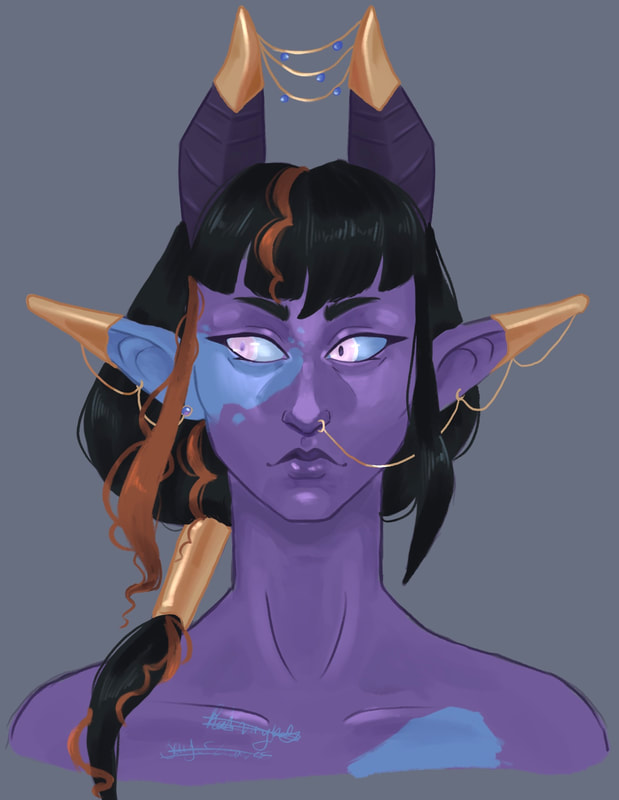
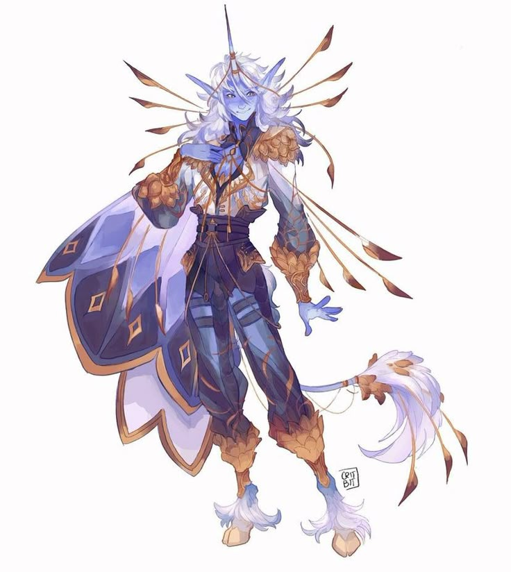
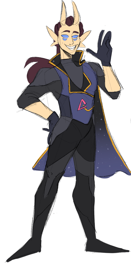
First we have Veritas, A powerful Fey king. Im taking inspirations from other dnd species, mainly the demon folk (Tieflings). I want to emphasise colours when it comes to the fey characters, they should stand out from the rest of the cast due to them being from a different plane of existence, their whole way of life is different to everyone else's.
|
What would a daughter between these two powerful fairies look like.
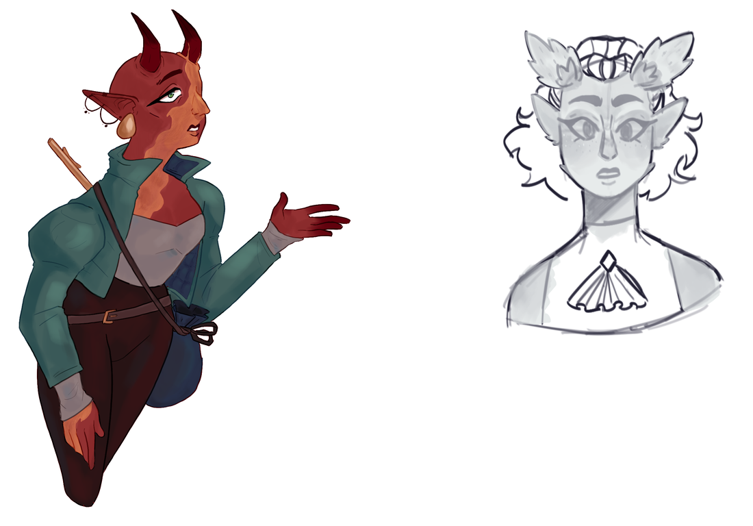
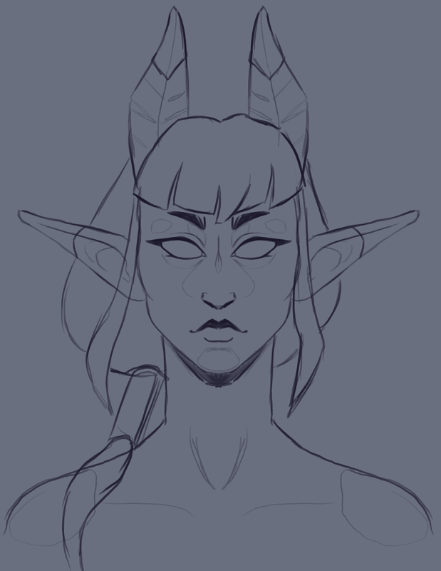
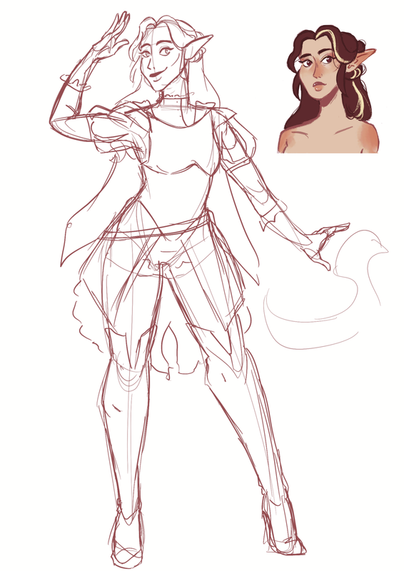
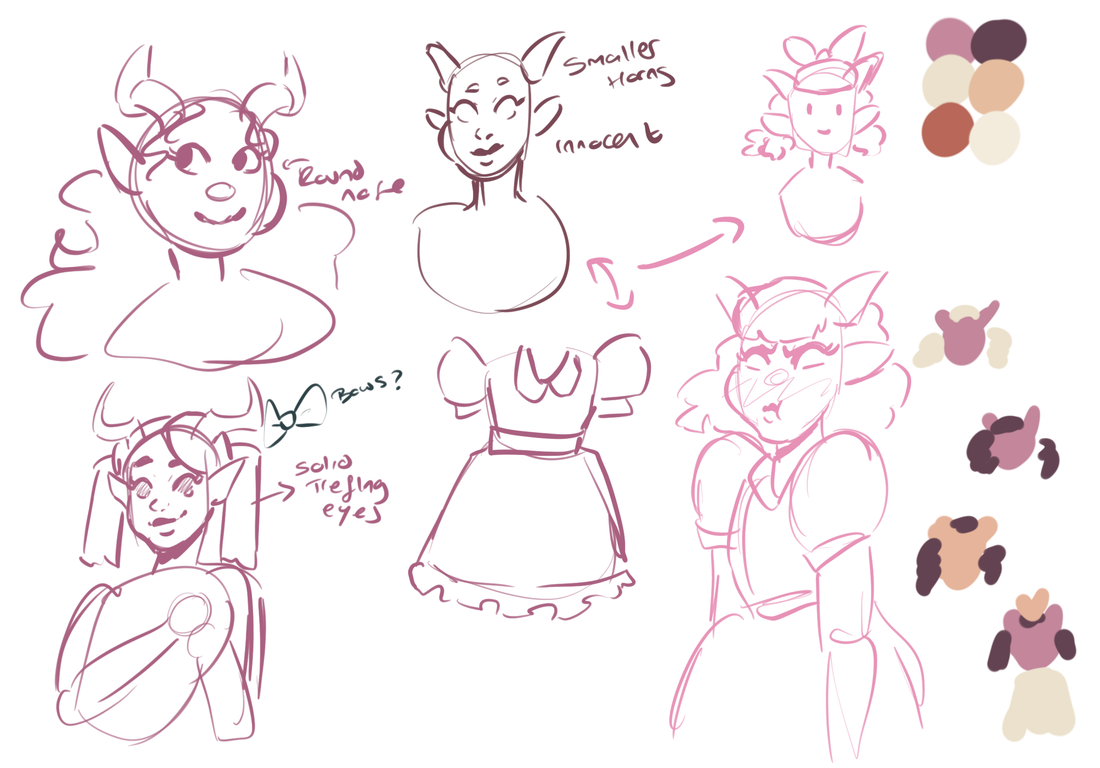
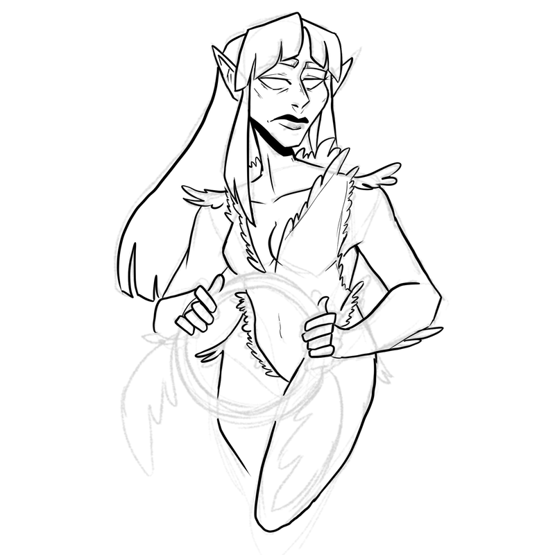
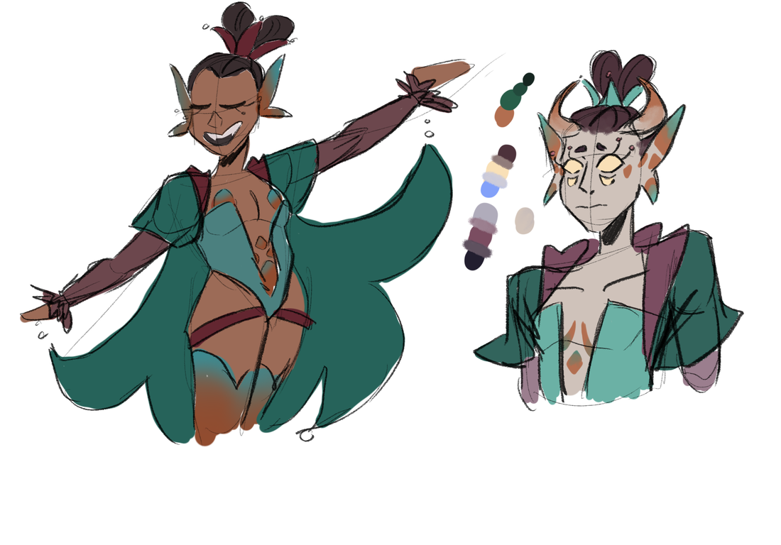
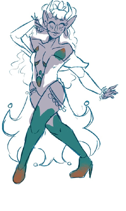
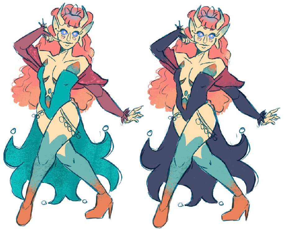
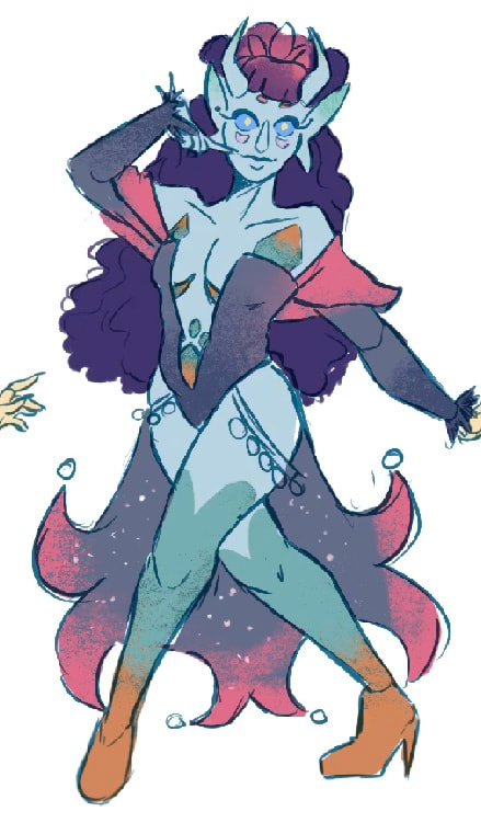
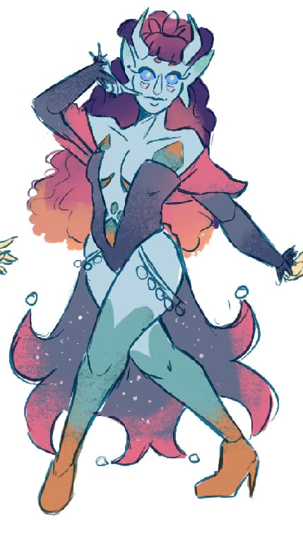
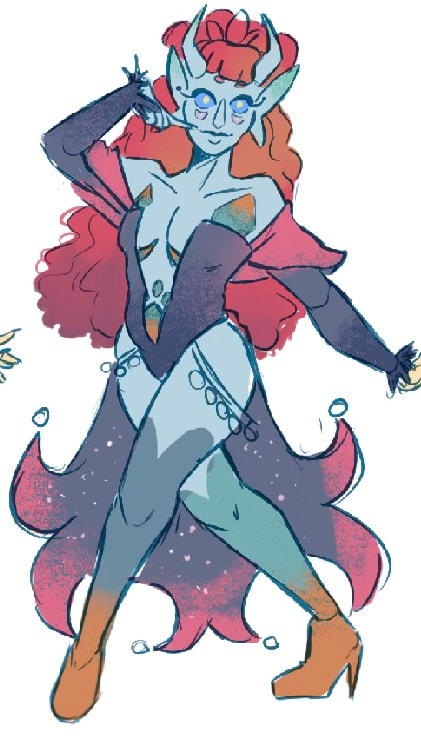
She likes to play with disguises meaning she is used to looking however she likes, However before designing these, I needed to know what she actually looked like. Verasee has a copper themed design, at this stage of designing, I had found it difficult to get the colours how I wanted. I couldn't get the personality out through her design as all of the colours were desaturated and plain.
Verasee Is a bright and bubbly girl, this needs to come out more in her colours.
Verasee Is a bright and bubbly girl, this needs to come out more in her colours.
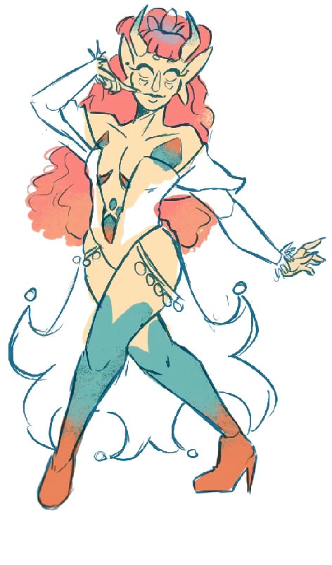
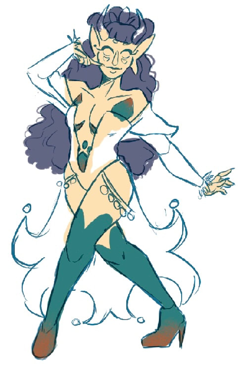
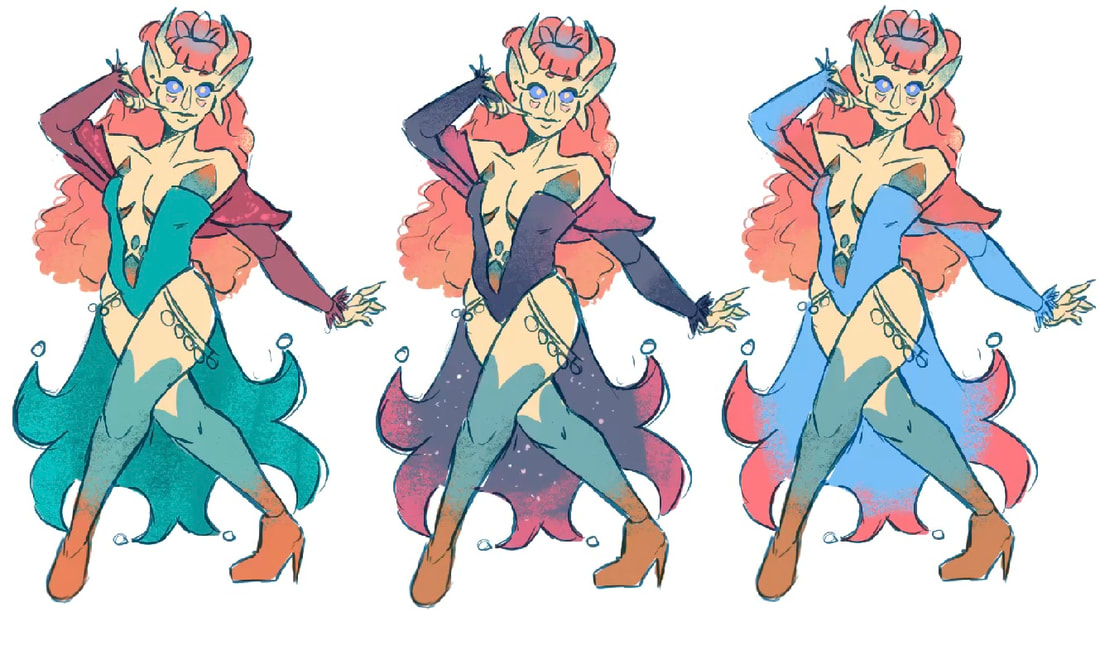
Once I had settled on an overall design for Verasee, it was time to work on the colours. Like the last design, I want to show aspects of her parents throughout her colours, meaning yellows, purples and pinks should be the main ones.
|
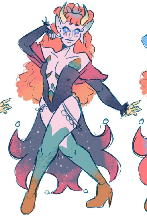
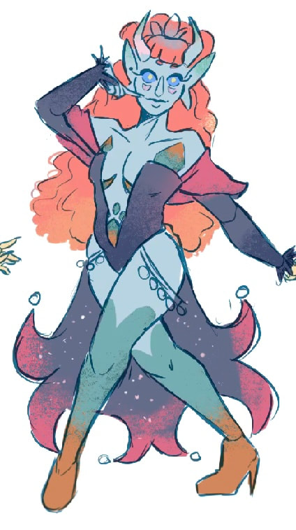
This is what I have Chosen for her final colours. She is very much based off her fathers colours, with the same skin and a much lighter version of her hair.
When it comes to her character in the narrative, she does get another form. Visually the design is the same however the colours change to look more like her mothers.
Verasee's two colour pallets are inspired by day and night (mother and father) |
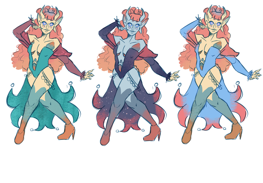
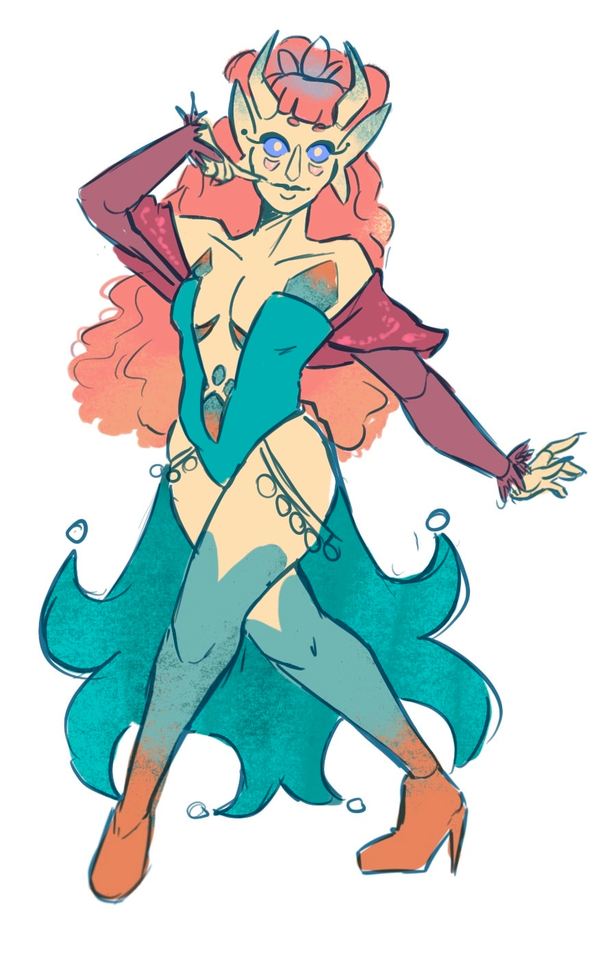
The final colours + additional outfit colour
Verasee Illustrations
|
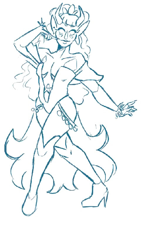
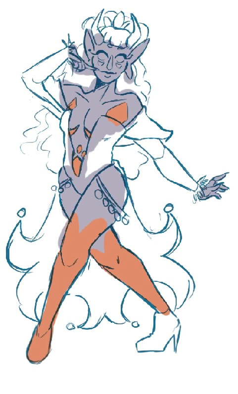
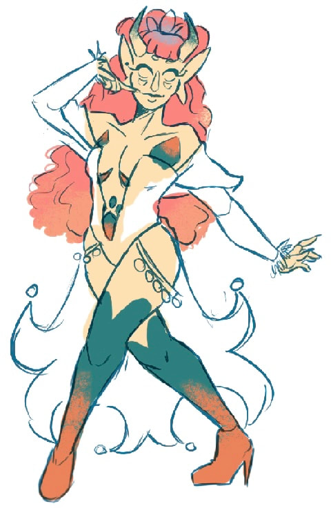
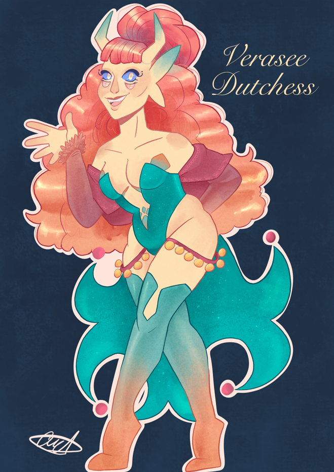
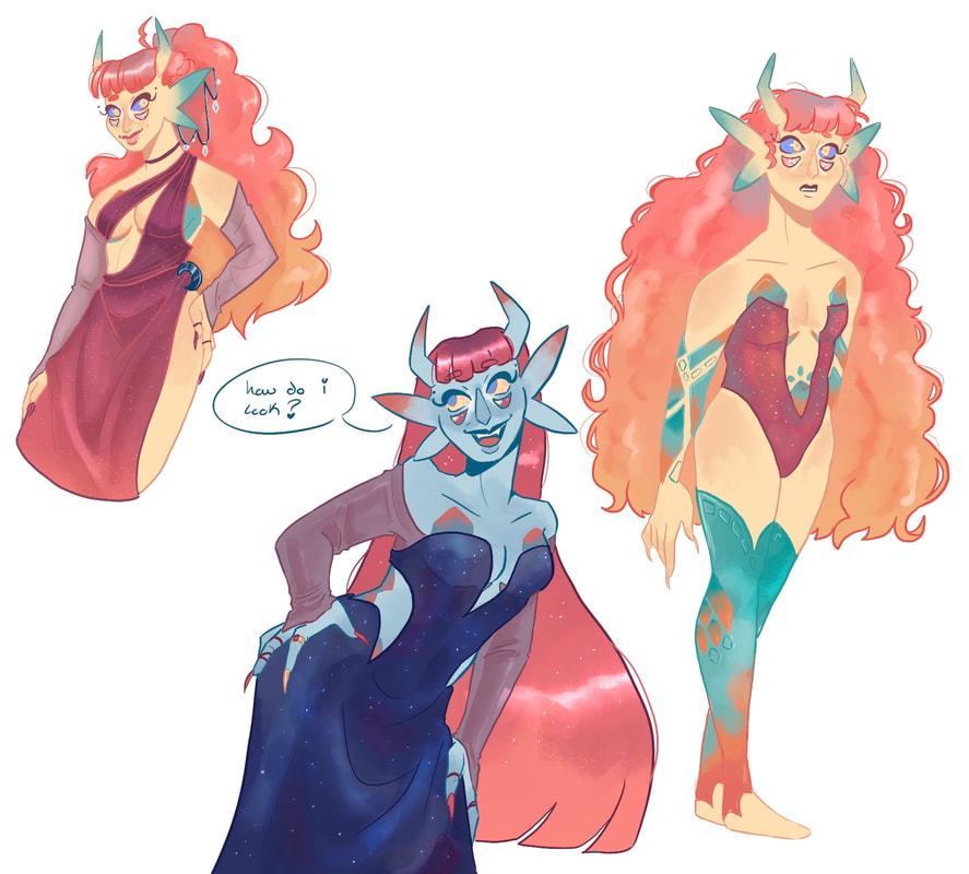
Illustration to show off her final design.
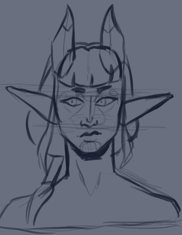
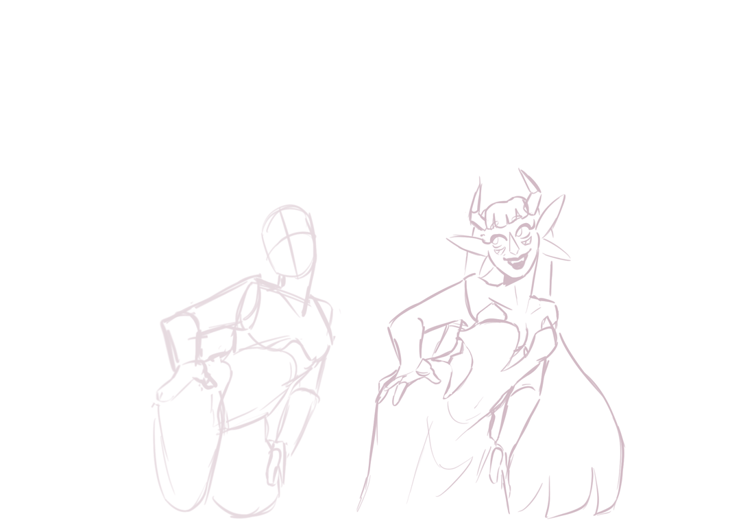
I think that I could work more on the face, looking more into the techniques learned earlier on in the project. For this piece I was more focused on getting her design elements down than actually rendering the piece to make her look truly to how I imagine her. |
I believe that these pieces show off her personality a bit more. I have also managed to figure out her face more, I think my main struggle was figuring out how to make the eyes work with the rest of the face.
Overall, I believe that I have developed my personal style to the point that I am happy with it. I enjoy how I use colour and shapes. I have found that rendering a piece is my favourite part of the character illustration process as it is the step that brings life into the piece. I enjoy being able to add in details specific to each character, weather it is marks on the skin or different strands of hair, I believe this to really bring a piece together.
Next steps
I believe that my next steps as a character designer is to create some reference sheets for my characters. This will help me overall as it gives me something to look at when producing artwork of my characters.
Despite the fact that I have drawn many unique characters, I believe that I could look into drawing more males, at this point in time I work within my comfort zone, drawing fantasy woman. what I need to do is spread out my skills over many different characters and appearances,.
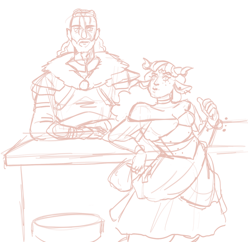
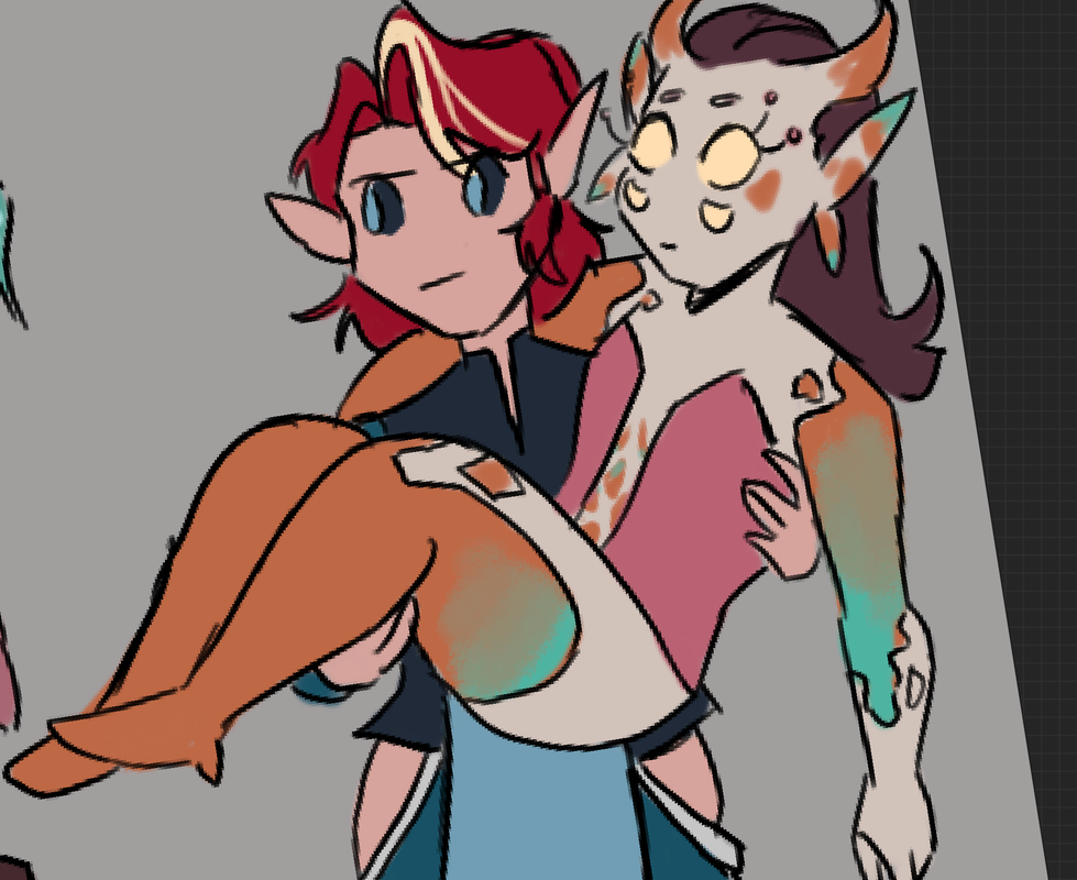
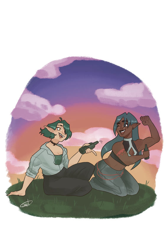
Another thing that I need to work on is characters interacting, doing this will help tell more of a story within my work, giving it some more life.
Site powered by Weebly. Managed by 34SP.com
