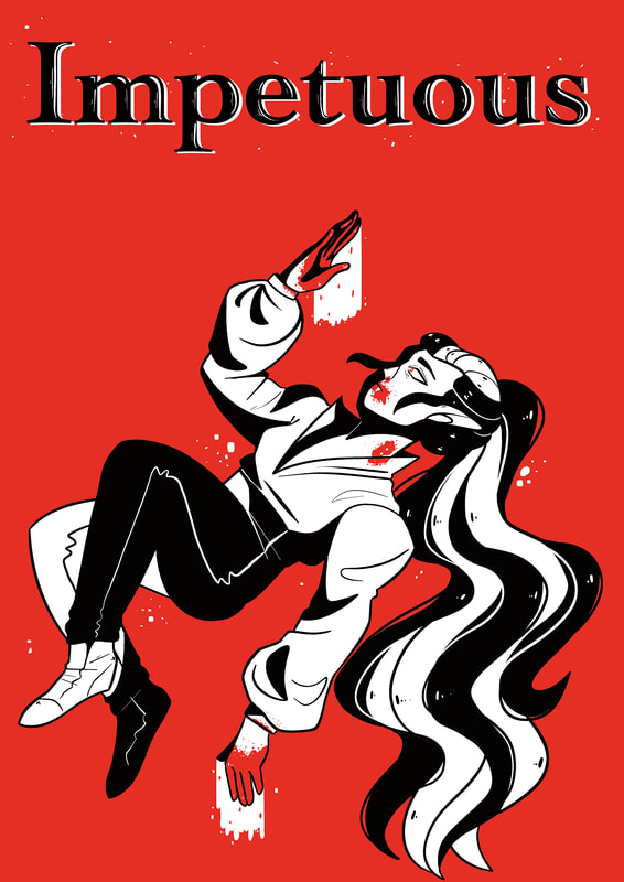
As a form of promotion for my comic book I want to create 3 unique posters showcasing some of the characters. The 3 characters I have chosen to present are Ophelia, Allure and Axwyn as the plot mainly revolves around them.
Each poster will be in a different style as a way to present different aspects of the story.
The only thing that will stay the same will be the title and maybe a few other elemants.
Each poster will be in a different style as a way to present different aspects of the story.
The only thing that will stay the same will be the title and maybe a few other elemants.
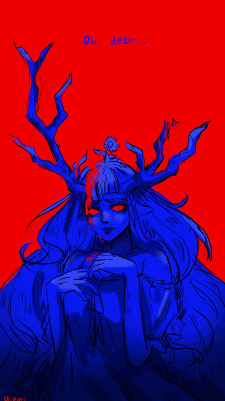
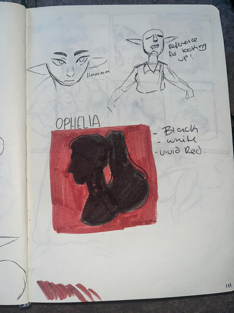
Ophelia
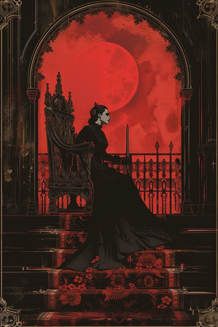
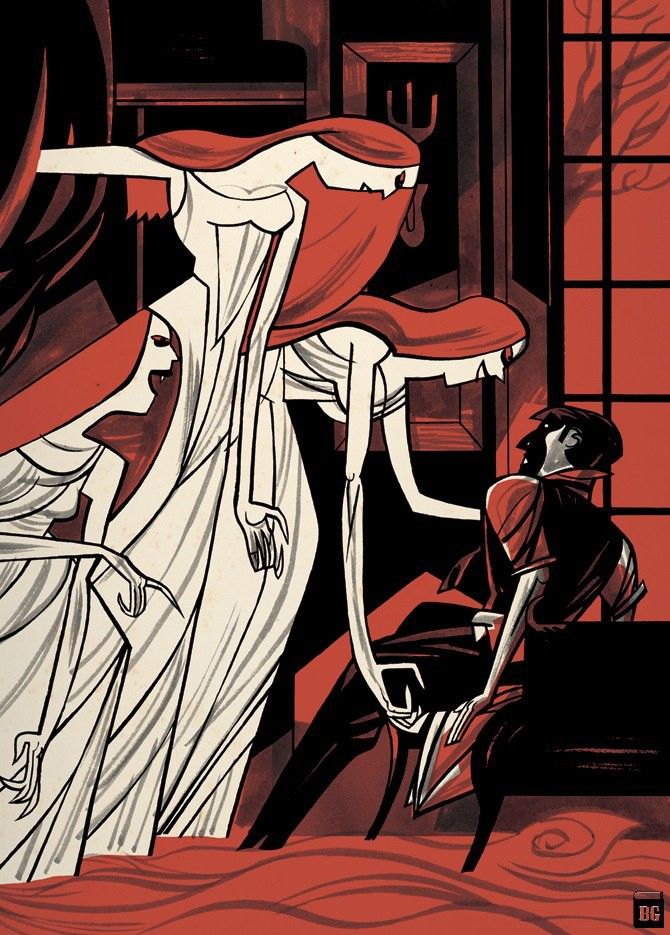
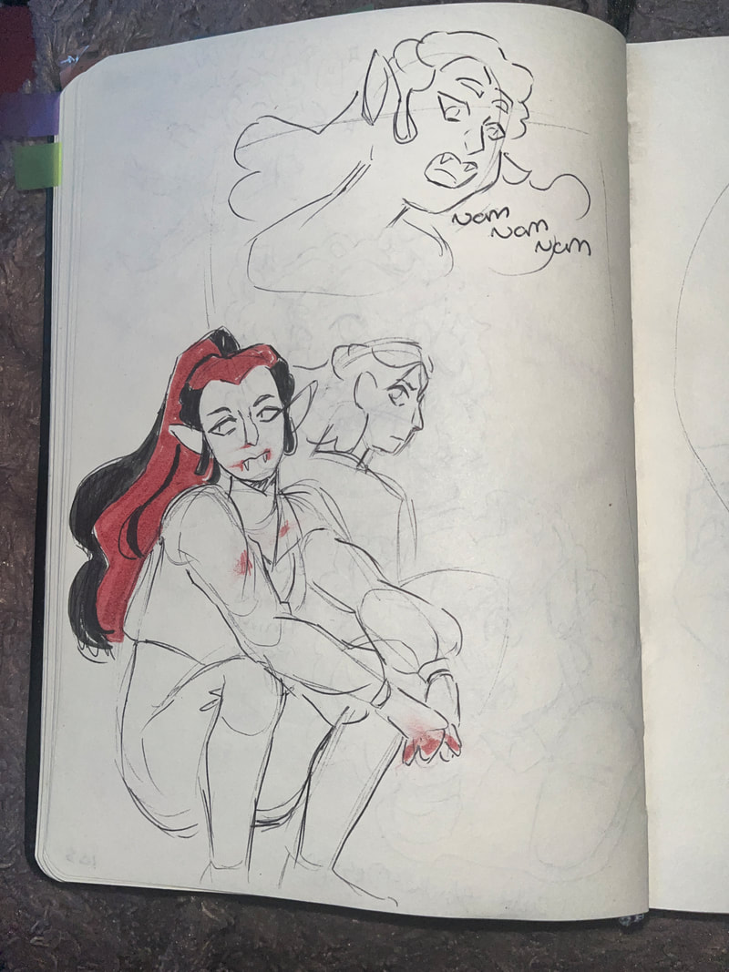
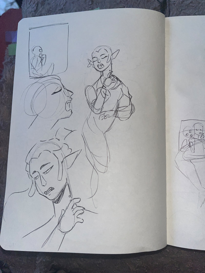
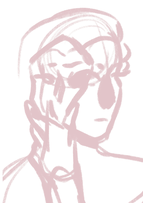
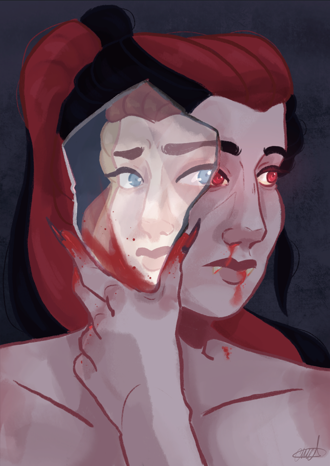
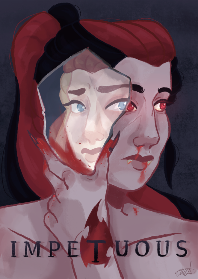
For Ophelia I wanted to emphasise the Vampire aspect of her character. I wanted to use vivid reds and blacks to help convey emotion.
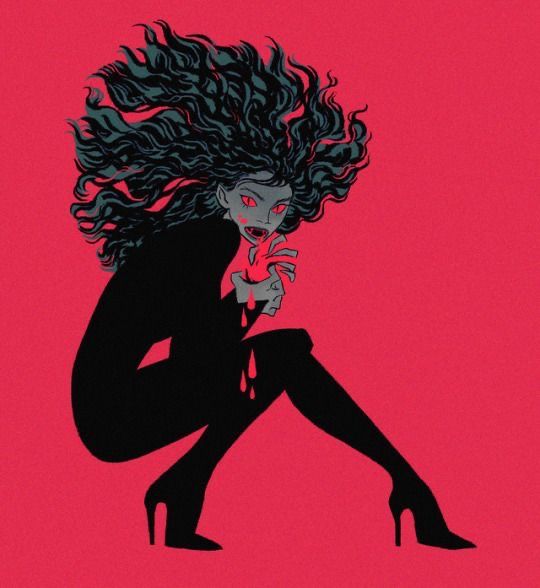
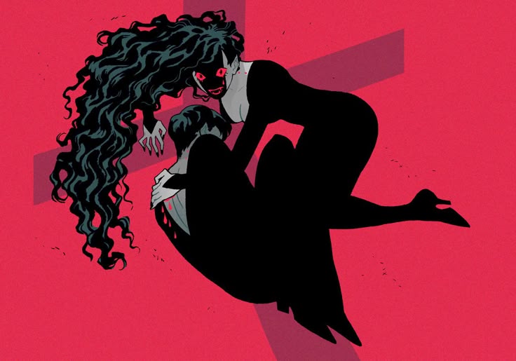
Inspirations
Inspirations
|
|
|
|
|
|
|

|
|

I want to be able to show Ophelia's fear of being a vampire through body language and colour. Black white and red will be the only colours featured, I'm hoping that this limited colour palette will be a good challenge for me, especially since Ophelia usually features a lot of colours.
|

|

|
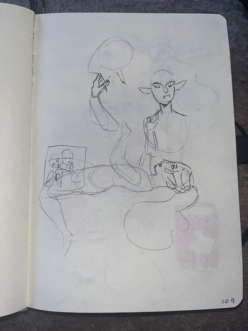
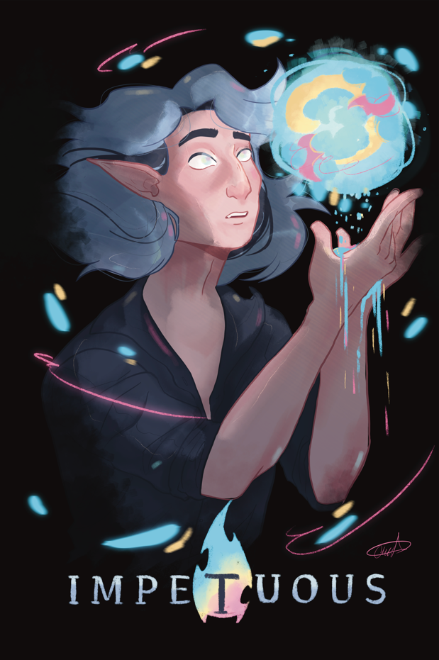
This isn't the final image. I would like to work on the entire piece again to make it stronger. I enjoy the body language but I think that I could push the fear in her face to make it more noticeable. I also want to push some of the shapes within the shading to make it smoother and look less rushed, at the minute the idea is there I just need to apply the technique with more understanding.
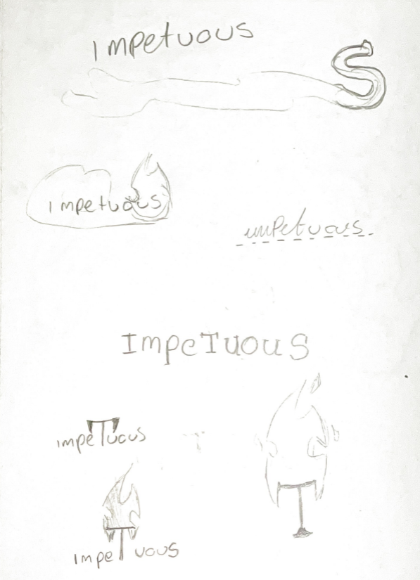
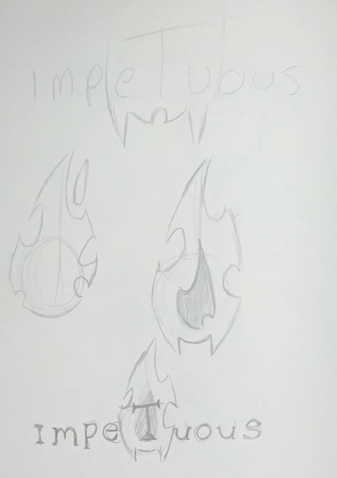
I also need to work on the type. At this stage there isn't a chosen typeface so I didn't have much to work with. I want something that will be able to work with all posters as well as the front cover of the comic book itself |
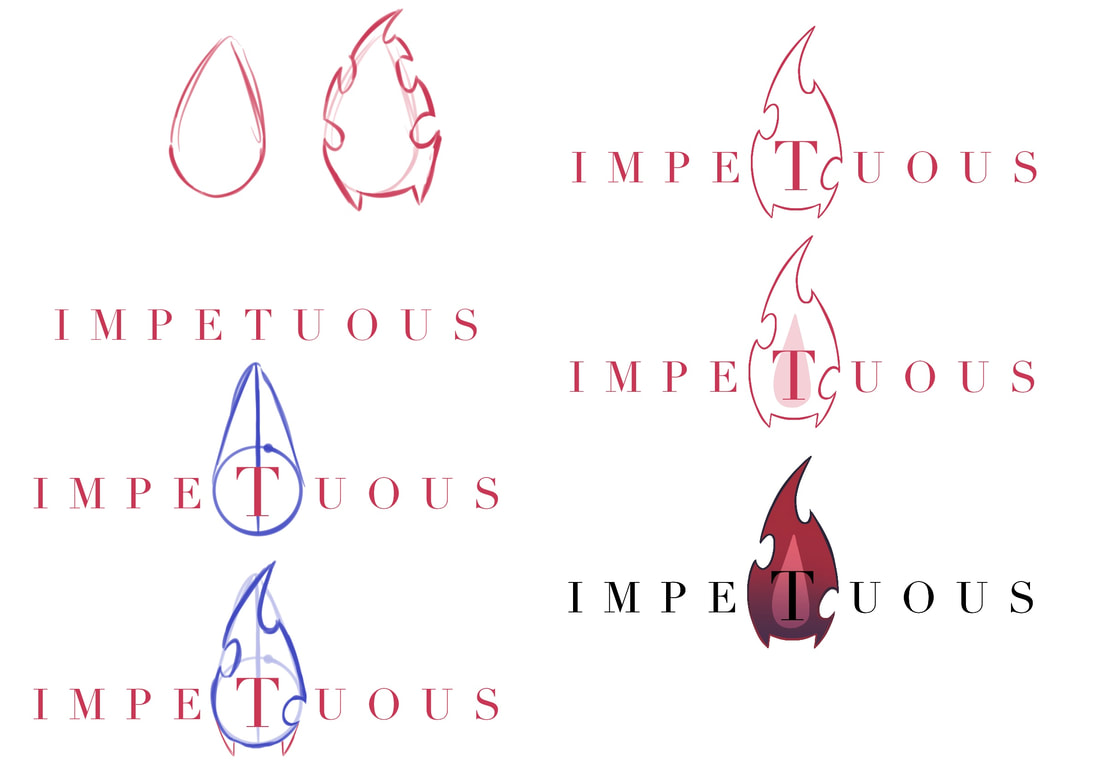
Type / Comic Logo
|
( Claire WILL Edit this photo)
|
For the type I want it to give off a serious tone whilst not being too complicated.
I want the logo to reflect Ophelia being a vampire and Allures fire like magic.
I want the logo to reflect Ophelia being a vampire and Allures fire like magic.
|
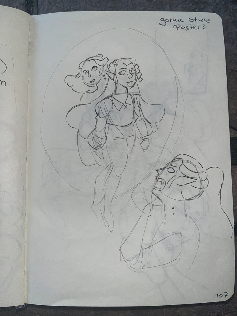
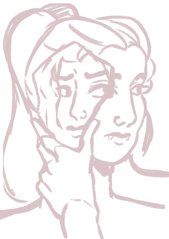
When scrolling through Pinterest, I found this photo and thought that it would be a good image for an Ophelia poster.
I want the two faces to represent her two halves, her past elven self and her current vampiric one. |

|
|
|
|
I decided to trace over my old logo with the brush I was using in procreate to attempt to make it fit in more with my chosen style for the piece.
I also chose to take off the line-work around the flame as a way to also make it fit in a bit more as well. |
|
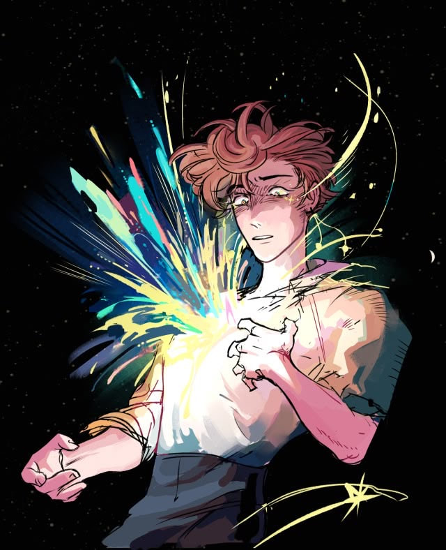
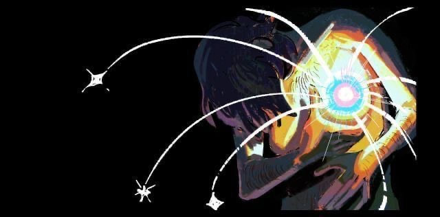
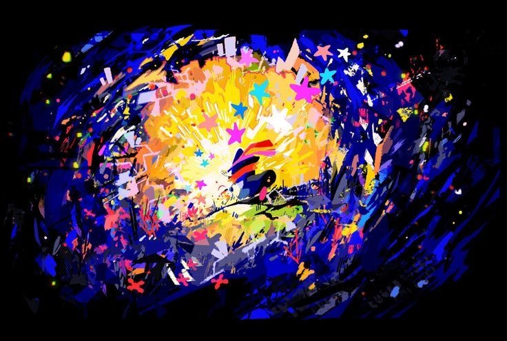
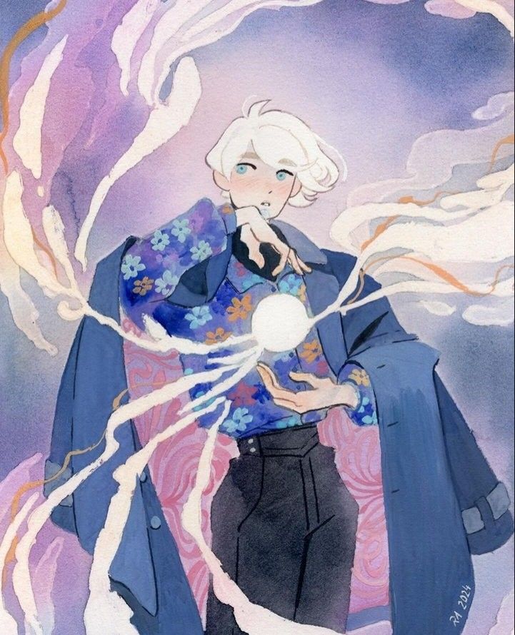
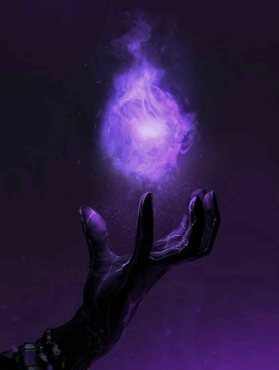
Axwyn
For Axwyn's poster I wanted to show off his magical abilities or how he came to have magic. I want the piece to be colourful with plenty of expression.
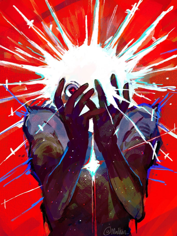
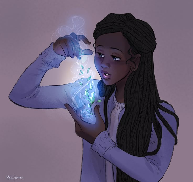
inspirations
|
|
|
|
|
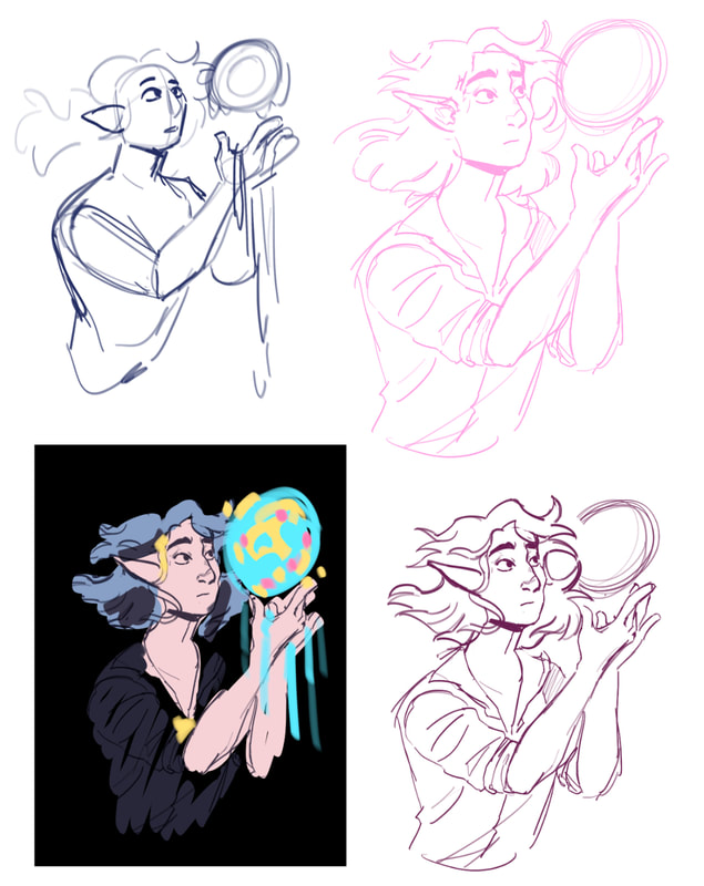
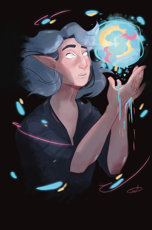
I enjoy the change in style for this piece. It is less cartoony than the actual comic but I have still managed to capture the characters design. I enjoy the contrast in colour and the movement that is created by the shapes and colour.
|

|

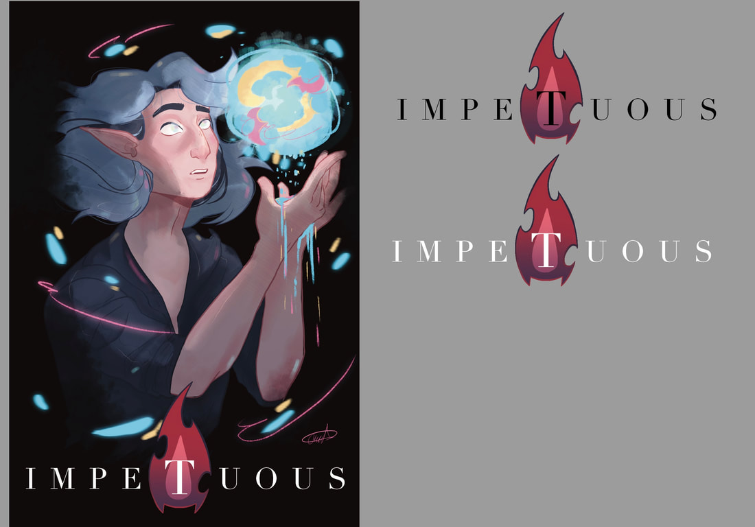
Axwyn themed logo!!!!!


|

|
I decided to take off the border due to a couple of issues when printing. I also decided to change the type to match along with the updated Ophelia illustration.
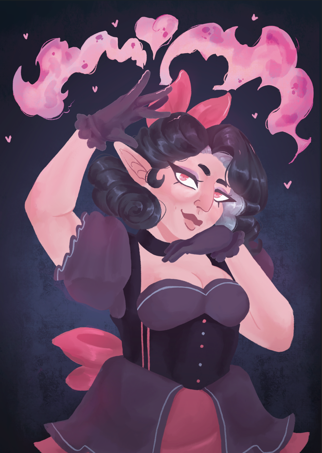
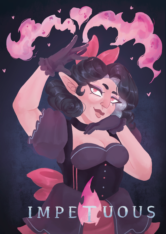
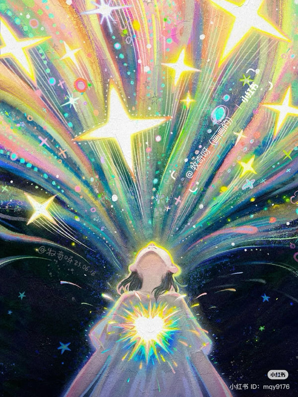
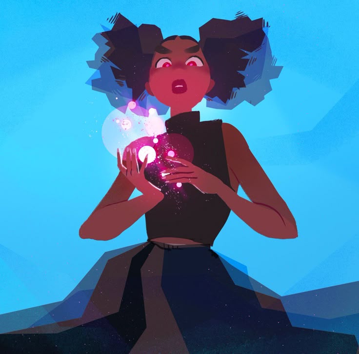
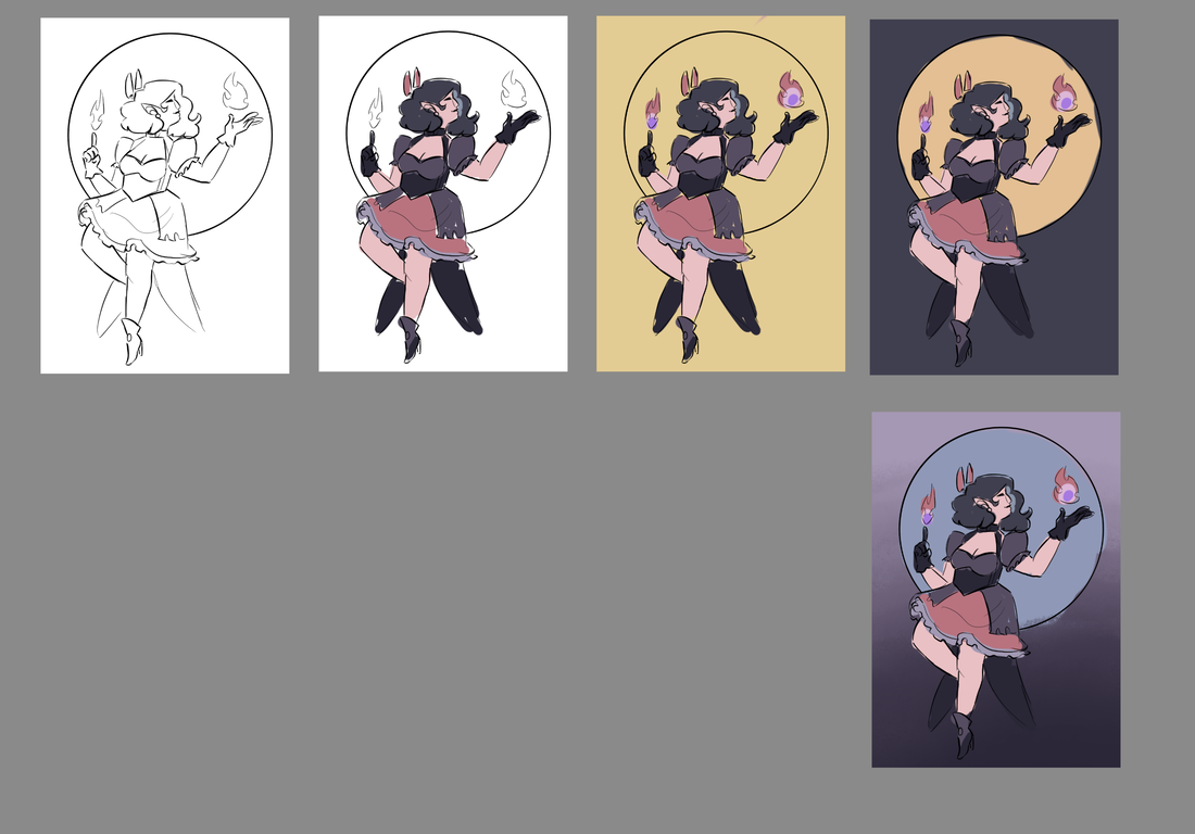
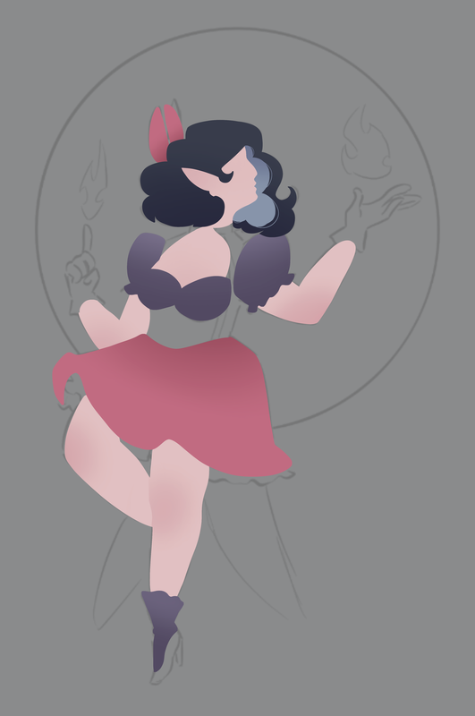
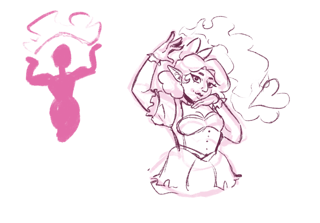
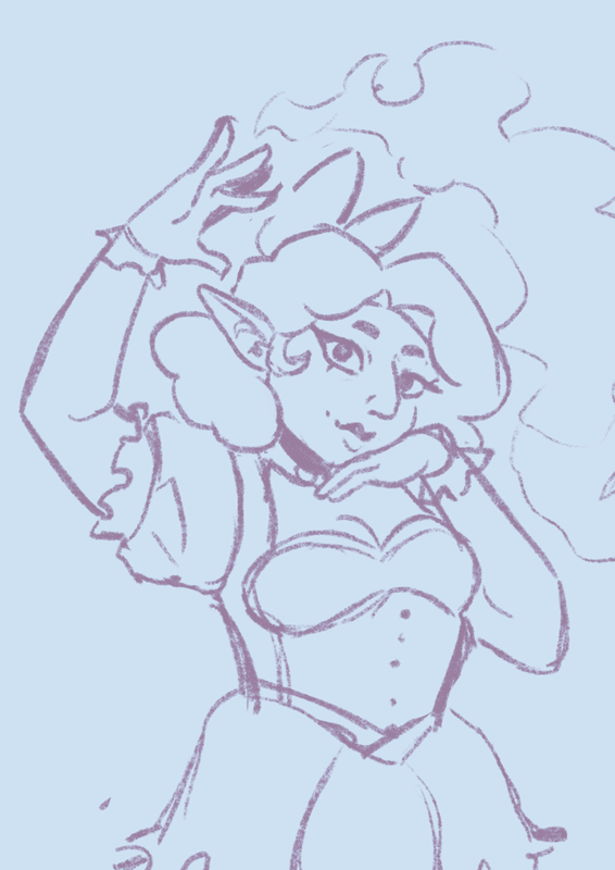
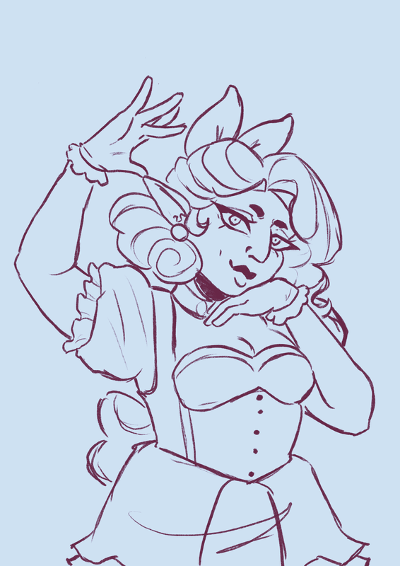
Allure
I wanted Allure's piece to mimic Axwyn's in terms of showing off their magical abilities. However, I wanted to show off some of her personality as well throughout the piece. I wanted to show off a more egotistical side to her when it comes to using her magic.
Like Axwyns illustration, I want lighting to play a key part in this piece, to help show off more of the magic that the sibling use.
Like Axwyns illustration, I want lighting to play a key part in this piece, to help show off more of the magic that the sibling use.
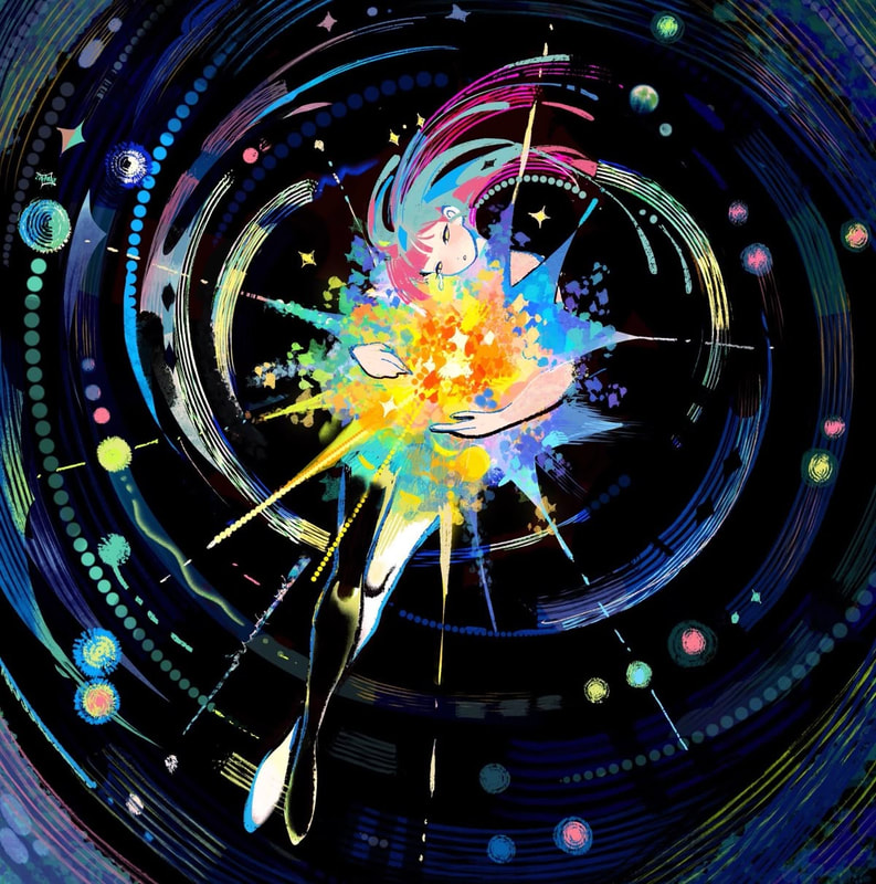
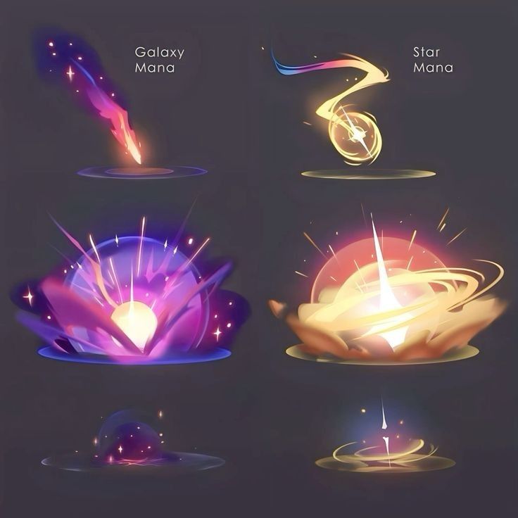
inspirations
|
|
|
|
|
|
|
|